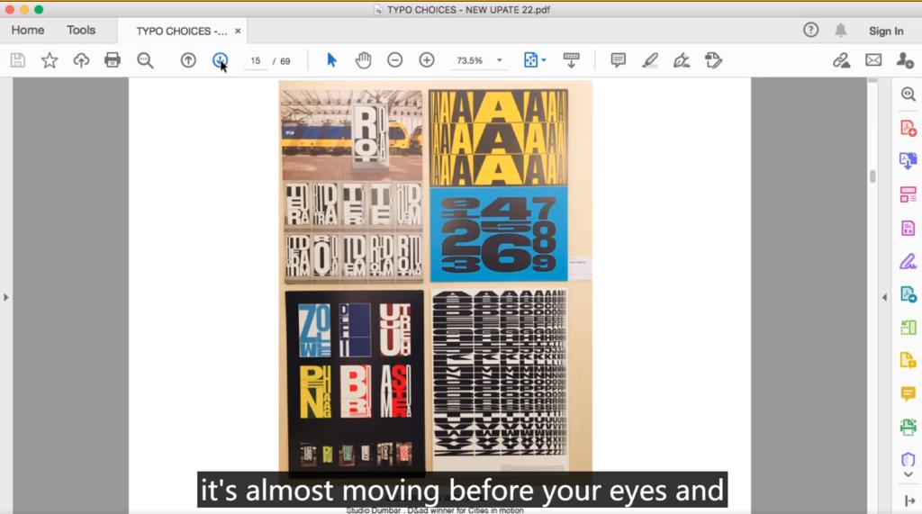
On Monday, a talk from Jackie Perkins shared the work of many artists, especially the opening image.
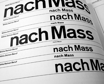
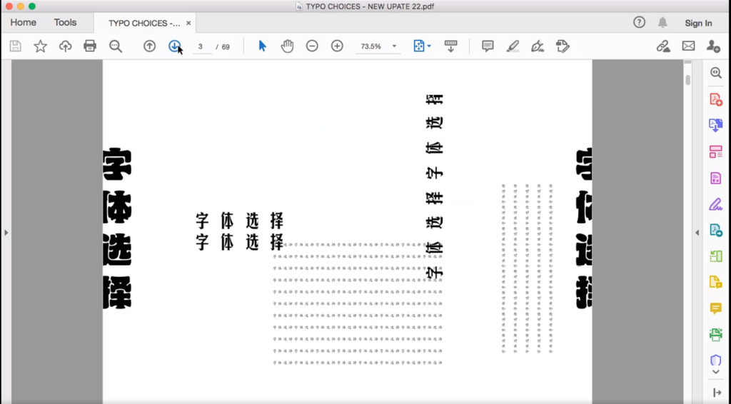
Of course I am very familiar with Chinese as my mother tongue. It also reminded me of two books I had read. One is Typographe from Emier ruder and the other is Kanji in three languages although I don’t remember the author’s name. One thing these two books have in common is that they describe the huge role that type and typography play in design.

As Jackie Perkins mentioned in the lecture, different fonts contain different emotions, and these differences will also bring different reading experiences to the audience. For example, sans serif typefaces are more modern because of the sharp corners of these typefaces, while serif typefaces are more humane. Using these details well in the design to mobilize the audience’s emotions and feelings, I think this is what a good designer should do.


On the other hand, the layout of the layout is equally important. The layout is the basis of many designs. Generally speaking, the layout design will be arranged according to the grid system, but the grid system is not a certain rule that must be followed. Limited by the grid, and dare not make bold creations. In the process of design, from the perspective of the audience, understand the needs of the audience and the information that they want to convey to the audience, and then promote the output of the design based on this.
