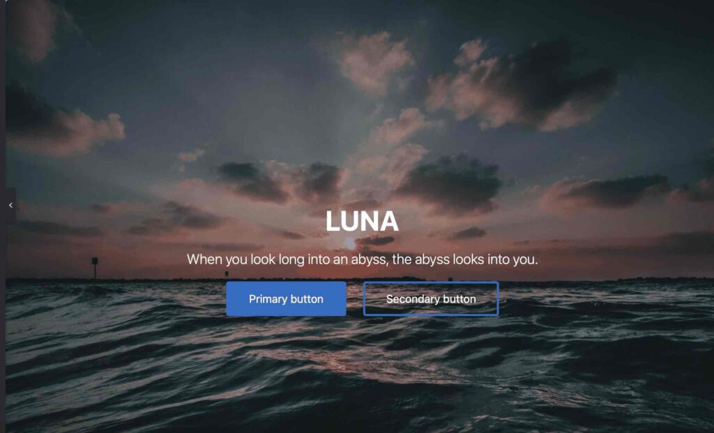
LUNA

When you look long into an abyss,the abyss looks into you.
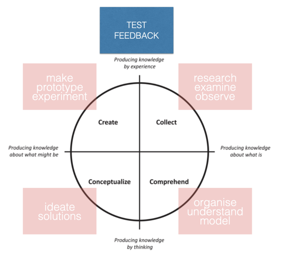
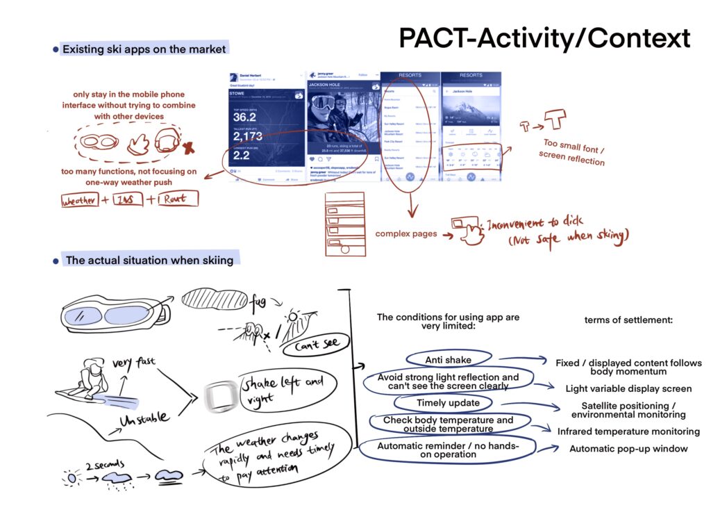
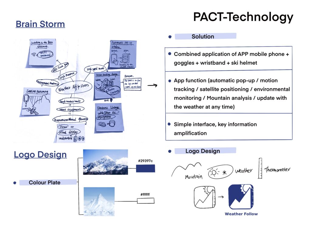
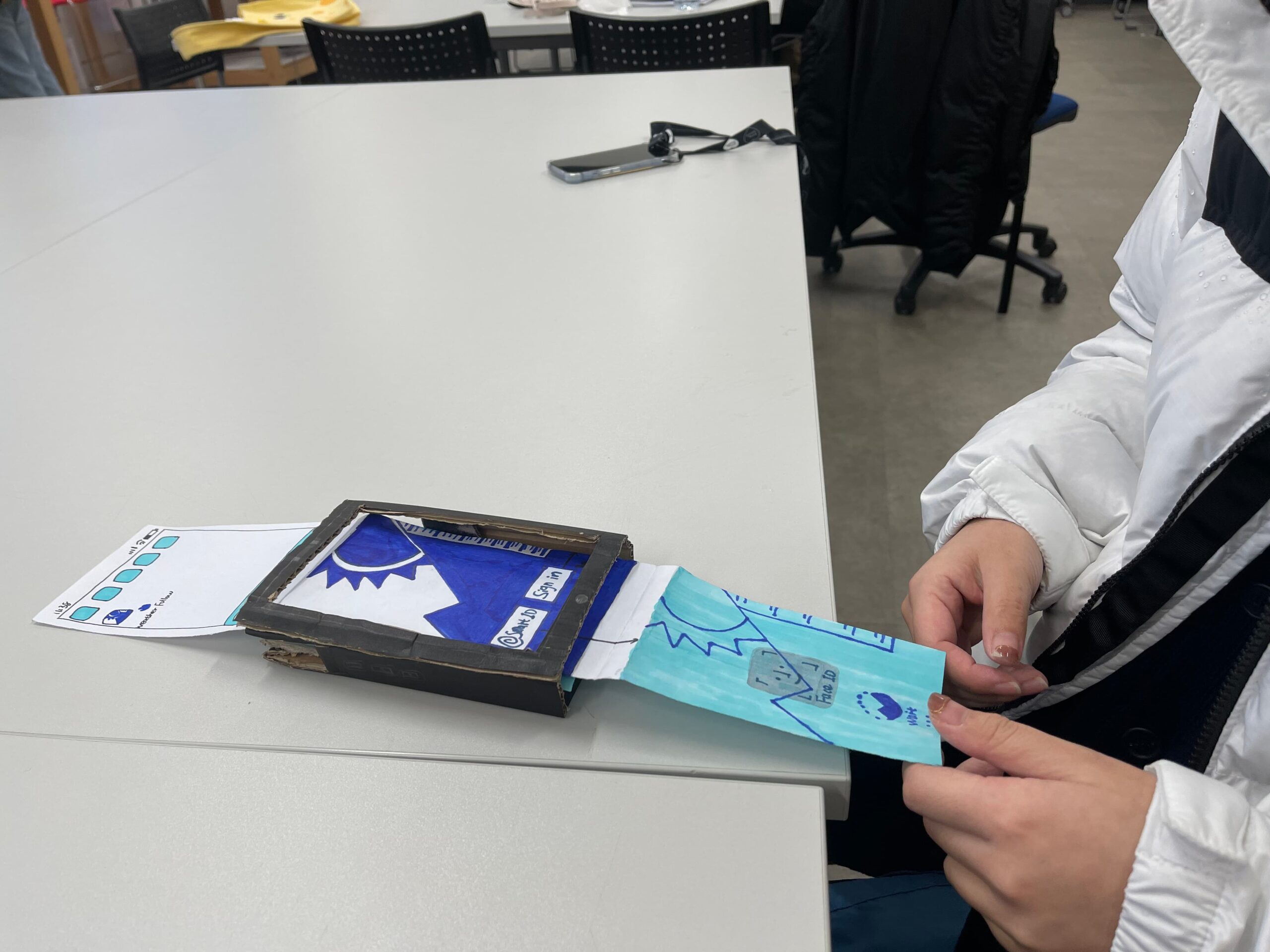
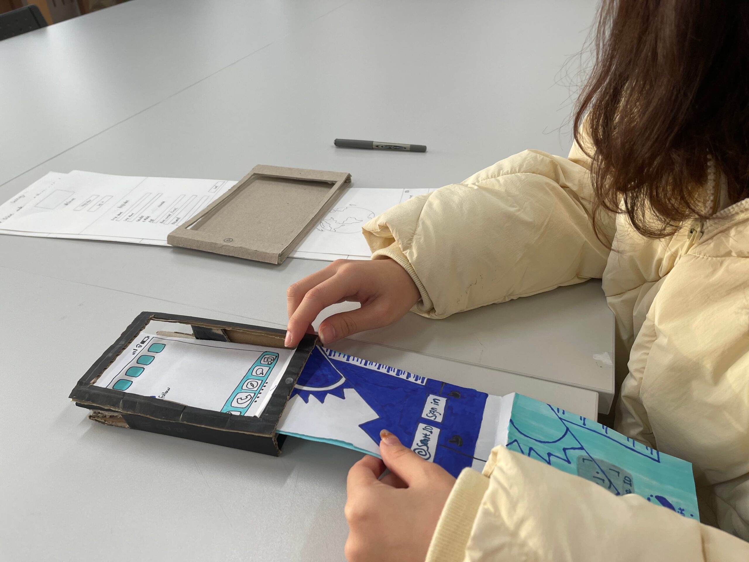
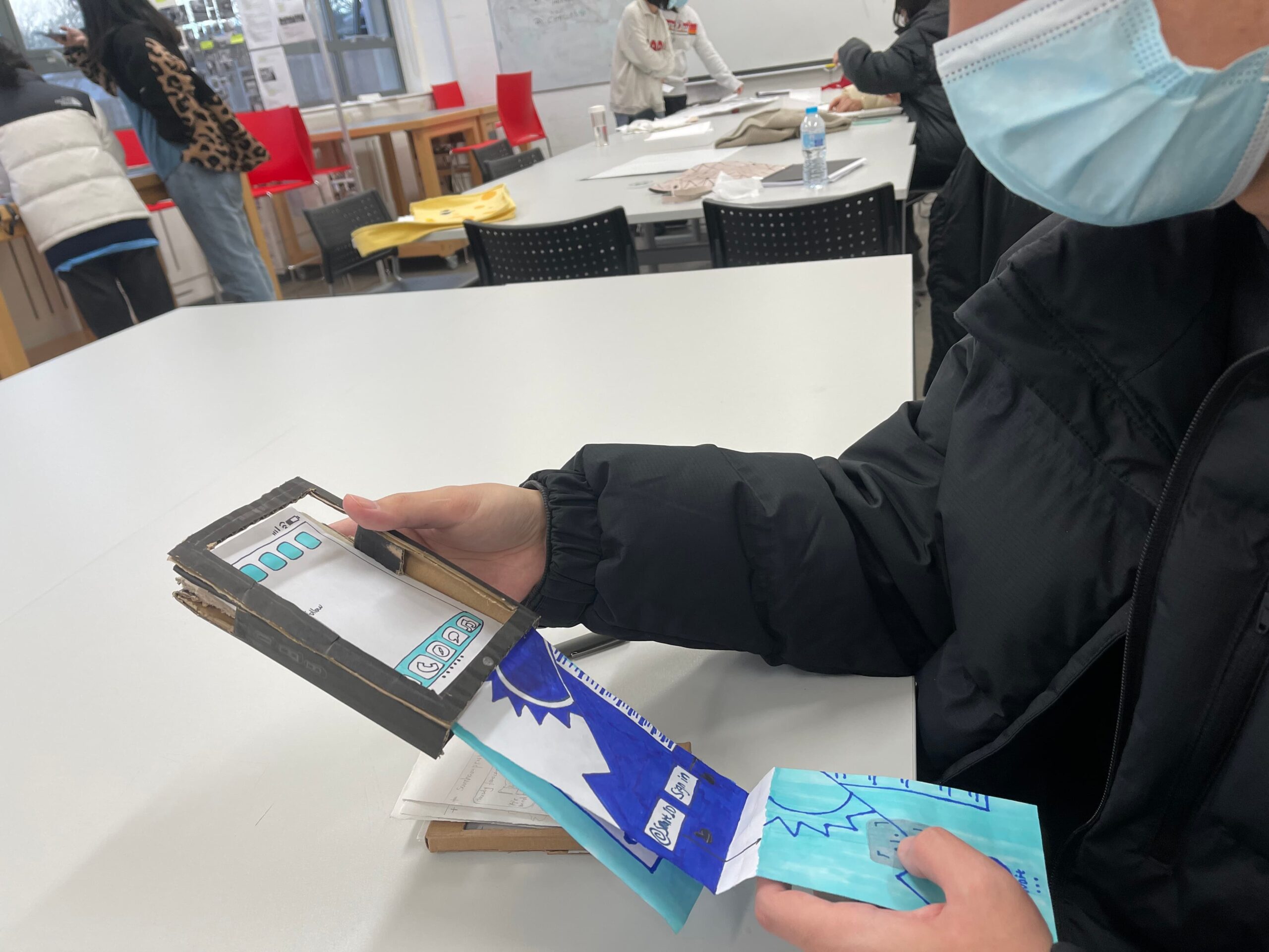
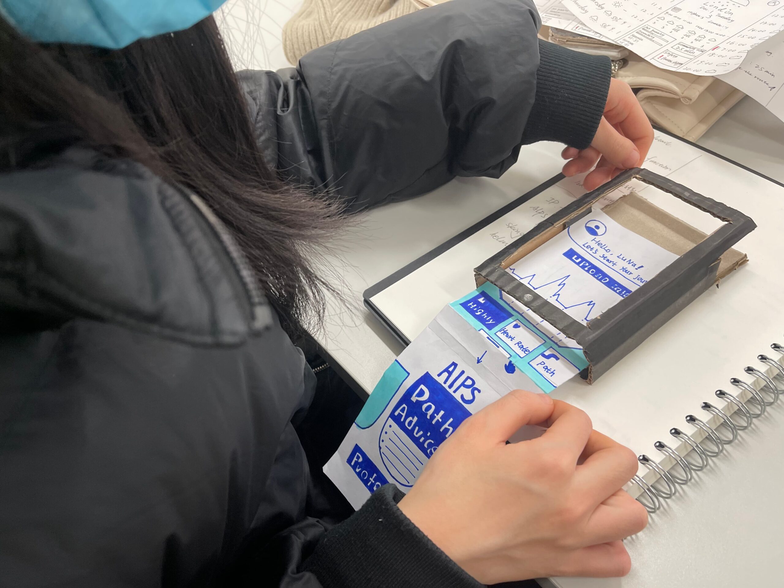
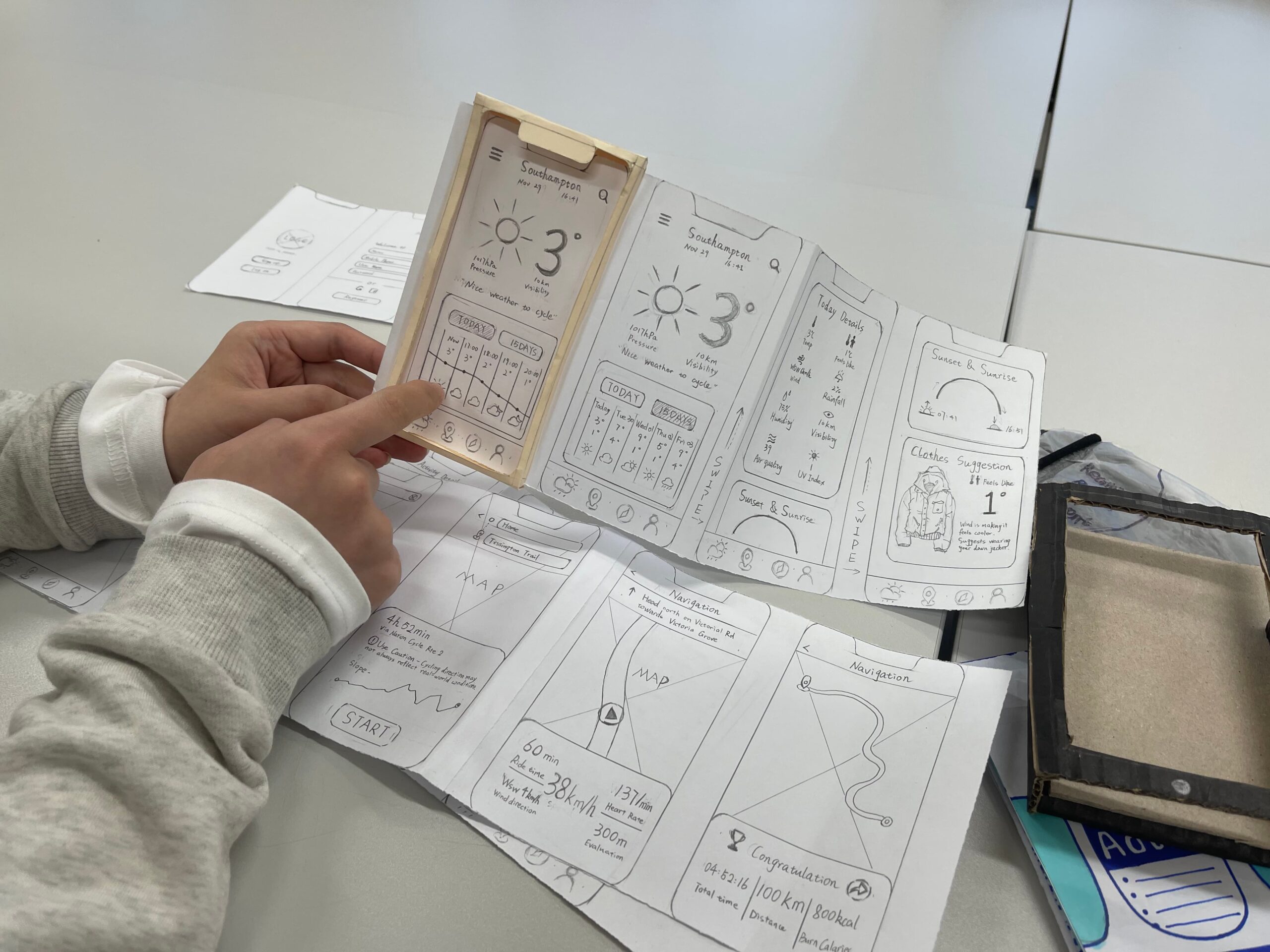
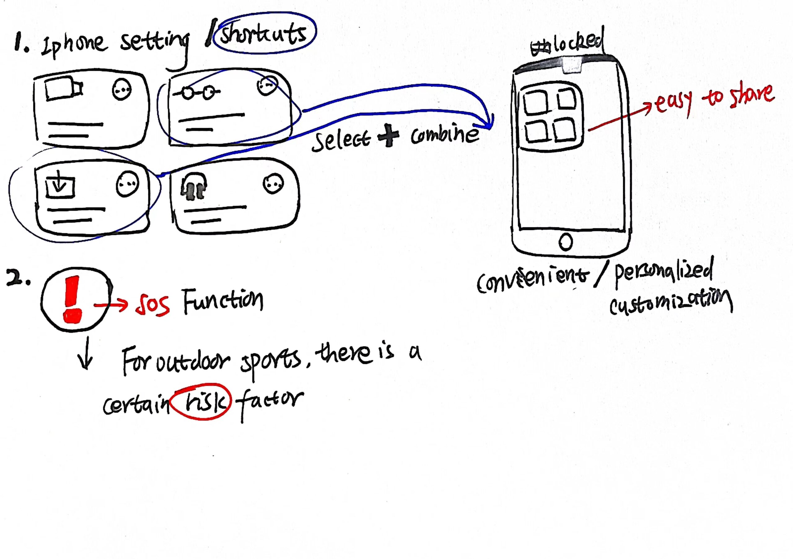
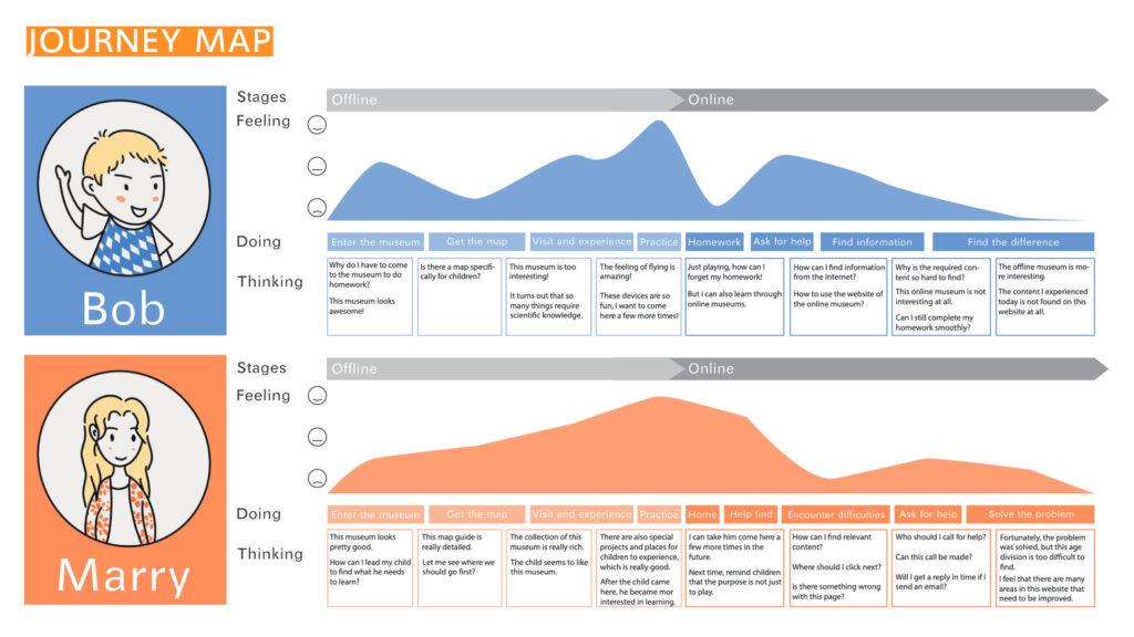
Archives 2021

Blog 07 | FinRep

D-Describe objectively what happened

What did I do, read, see, hear?

In the first semester, I made a total of 5 Briefs and 7 Blogs. I recorded the process of these contents through videos, texts and pictures, and published them on my own WordPress.

Luna’s Wordpress

In Brief and Blog, you can see the content records of group projects and personal projects that I have recorded. They have similarities and differences, but they all start from the user’s point of view, using the designer’s thinking and different forms of expression to show the personal understanding and thinking of the project.

User map explanation

I started to contact this course formally, and made actual feedback from Brief1-Mapping_me. This is my first contact with this course. In this brief, I show my hometown map and personal map through collage or graffiti.

Personal map

I heard that our tutor showed a lot of personal maps made by past students in various forms.

Self-Map reference

At the same time, Danny also told us that we don’t have to think about what we are doing right or wrong, because there is no right or wrong, so we just need to make the map we make to express where we come from and introduce ourselves, so I finally based on the surroundings The personal map based on experience and environment is a fresh first attempt.

Print sizing

After that, the teacher showed us the appropriate display size to display and print our homework, and we gradually became familiar with the school’s printing system.

When looking at everyone’s feedback, I saw more fresh perspectives and ways of showing myself. Some classmates used a Pac-Man game to show the life they experienced before entering the University of Southampton, turning everything in their life into beans, and I am the Pac-Man. I find it very interesting. Similarly, some students convert daily routines into visual clocks to divide different times of the day. They do not have too many words and straightforward pictures to display, but through another kind of visual experience, whether it is a game or a strong sense of impact, to convey a personal map of themselves.


At the same time, reading the literature gave me more content for reference and understanding. 

I remember that when I was still in China, we professionally received a brief summer assignment, which included the task of reading literature. 

The literature is about “deining and integrating the systems”.

                               First literature reading

There are many cases of combining classic architecture and visual design to give an overview of our profession. At the same time, it also talks about how to plan your own projects reasonably and make presentations. Tell it. After reading the literature, I split and combined the content of the literature, sorted out the main frame structure, and combined my own ideas to make the ppt needed for the presentation.

Frame summary of references

In more projects in the future, I will also use more literature to help understand the project I am going to do. For example, in BRIEF 03-DA NM DRAWING IDEAS, I read the e-book “Drawing Ideas” to gain a better understanding of the specific parts of the project to be drawn.

Sketch after references

AI painted hamburger

In the first semester, we also learned some software applications. The content of this part was taught by Chris. First of all, it is Ai in the Adobe series. Through the course, I can understand the use of basic tools. I still remember that in the course of learning ai, I drew a basic hamburger pattern with Chris. Chris said that those two slices of cheese are like teeth, which is really funny!

Andy page layout display

Similarly, the quotation of WordPress is also interspersed from this kind of software-guided courses. I have never used WordPress before, and I don’t know how to deal with the web plug-ins and themes in it. Later, I will demonstrate through Andy’s offline courses. I gradually learned how to lay out the webpage, and combined with Chris’ basic description of html and acc, I made my own website page.

I —Interpret the events 

What did I do, read, see, hear?

In the first semester, I made a total of 5 Briefs and 7 Blogs. I recorded the process of these contents through videos, texts and pictures, and published them on my own WordPress.

                                        Persona                                                                                   Journey Map


By assuming that we become a user, we experience a series of changes in experience and emotions. In the process, we can use sticky notes to write down a few general problems.

                                     Sticky notes

The research and discussion of these contents helps me to design from the user’s point of view. Therefore, after learning this basic framework, in future projects, I will bring myself into the audience of apps or interactive devices to think about the pain points that the project focuses on and upgrade solutions.

Museum Project-Persona

Weather APP-Persona

This may mean that I can start from the user’s point of view, rather than a ‘designer’ who blindly pursues a good-looking interface or a sophisticated layout. This point is very important to me, because my undergraduate graphic design is very different from the interaction I have learned now. To a certain extent, the interaction design I now learn should include graphic design, but The design coverage is more extensive.

Design Duality

Museum Project

My brand-new insights and theories are reflected in the starting point of the project. This starting point may be my request for optimization of the online museum in Brief to attract more visitors, or it may be a problem in the current society.

‘Get Real ’Project


For example, because of parents’ addiction. Mobile phone and missed the growth of the child.

Weather APP Project


Or it is to upgrade and optimize the current human-computer interaction to provide more targeted services, for example: provide weather apps for skiers or mountain climbers.

In summary, I have strengthened the cultivation of social consensus and empathy in different projects in the first semester, which makes me feel very meaningful.

E – Evaluate what you learned

 How was this useful?’

In the first semester of study, I learned a lot.

First, it is the spirit of teamwork. Because our second Brief is a group project, we need to divide the work to conduct research, and at the same time, we need to assign different team members to be responsible for the connection of each part.

Group cooperation – 01

In the process, I learned to communicate, and at the same time I collided with other team members and came up with many interesting and novel ideas. The previous undergraduate majors of our group members are not the same. From our research and the process of proposing ideas, we can see these wonderful differences. We all have our own specialties. When combined, we can learn from each other. The project is more complete.

Group cooperation – 02

Then, self-learning ability I think is also a very important skill I learned. After entering the formal courses in Southampton, I learned that a lot of software learning and investigation are based on my own initiative to explore. The tutor will give us a channel to learn software, but it will not teach it completely by hand. More often, the ability of self-learning is extremely important. For me, this has undoubtedly expanded my cognition, and at the same time I understand my own shortcomings and learn, which also jumped out of my own comfort zone.

Adobe XD software tutorial

Then, there is a reasonable and step-by-step project promotion process. In this part, I am mainly logically self-consistent. It is very important to find the cause of the user’s problem, and then to explore the result. In the first semester of the project, we can often hear the teacher tell us why we should do this? Is this necessary? And what are the benefits of doing so? And other issues. At the same time, it is also important to express each part clearly, because even non-professionals can understand and use it through simple graphics or models. This is mentioned in Affordance.

After that, I think it is necessary to actively seek feedback, because only when users experience the output you designed and ask questions and opinions, can they fully understand whether their application or output can be more effective. Target market. Design is very important, but it is also essential to be able to reach the market.

Design Process

P – Plan how this learning will be applied

‘How might this learning apply in my future?’

My future career may also choose design-related positions. However, many design companies now require designers to have design capabilities in multiple directions. For example, when I was in the previous undergraduate school, my professional teacher told me that when designing web interface for graphic design positions, it is best to be able to The front-end development of webpage programming can better present the desired design effect. Therefore, when I studied interaction design at the graduate level that was different from the undergraduate level, I learned more possibilities created by cross-professional integration.

And the self-study ability learned in the first semester may allow me to express my design ideas in more diverse forms of art. Because I think that learning a new software and new function in the process of designing a project will deepen my proficiency and application ability.

At the same time, after learning empathy in interaction design, it is easier for me to focus on social issues or minor inconveniences in my life. When I encounter these problems, I always ask myself in my heart what would I do if I were to optimize and improve? I think this is very good for the cultivation of my design thinking.

Then, critical thinking is also a learning skill I learned in the first semester. To look at a design work dialectically, not only from the appearance, but also to combine the social background, cultural background and environment it creates. When you see the good side of the work of art, you can also see the side that it needs to be improved. . When I do projects later, this dialectical thinking may allow me to self-censor.


Brief 01 | Mapping-Me

 Hometown map

 This map about me was inspired by my hometown, Zhengzhou, Henan Province. First of all, the overall color of this picture is earthy yellow, because Henan is a big province famous for its agriculture. In the lower left corner of the picture, I located the CBD in the center of Zhengzhou from Google map, which is the most prosperous center of Zhengzhou economy.

First of all, the map of Henan is on the far left, which extends out of the Tang Palace Banquet in Henan. The performers imitate the music and dance figurines of the Sui Dynasty unearthed from Zhang Sheng’s tomb in Anyang, Henan Province in 1959.

Then there are China’s famous Tang poetry and Henan opera, and the latter part is the old newspaper of Henan Daily.

Next is the Longmen Grottoes in Luoyang, Henan Province, which is the largest stone carving art treasure house with the largest number of statues in the world. The carved Buddha is lifelike.
Then there is the Shaolin Temple in Songshan, Henan Province. It is one of the birthplaces of Chinese Kung Fu, and Buddhism also came into being here.

Looking to the right, it is the high-speed railway in Zhengzhou. Because Zhengzhou is located in the center of an important transportation hub, the transportation is very convenient. High speed rail and 5g are the characteristics of Zhengzhou.
The last picture is the original central building of Zhengzhou – Erqi tower, which is one of the earliest memorial buildings in New China. This is my hometown map.

    Personal map

 This is a personal map about me. In this map, different color blocks represent different stages of my life.

The green and vibrant part is my childhood. In this part, I recorded my parents’ marriage, pregnancy and my birth.
In the orange part, I recorded all the interesting trips I experienced in my childhood.
The yellow part is the stage of my growth. I have more friends and participated in a lot of social activities.
The purple part is the part where I want to study in Southampton. There are many question marks to represent all the unknowns and possibilities.

Brief 04 | Weather App

In this project, I designed a weather app linked with other devices for 【skiing, mountaineering and other enthusiasts】as the target population.

- RESEARCH PACT

I did some research at the beginning of the project. These surveys help me better understand the pages and functions required by this app with user empathy. 

The following are some visual contents I have done according to the initial research, as well as the preliminary design of the app page :

- FINAL

- TESTING

Then there is the app demo interface I made with paper model, which can help users better understand the jump and details between each interface.

                Process

I recorded some steps of making paper model.

For me, manual work is difficult because I can’t have 3D model concept.

But this challenging step makes me feel very fresh.

Finally, I use YouTube video to record my actual operation of the paper model.

Blog 06 | Testing

      Today, we tested the weather app designed in project 04 to simulate users. We took several people as teams to understand and simulate each other’s weather app.
      First of all, in the first group, my partner said that when operating my interface, he could clearly understand that I was designed for extreme sports personnel such as skiing or mountaineering, which was more targeted. Because my app interface is relatively clear as a whole, and I also linked ski helmets and ski goggles to liberate my hands.
                                                                                       First Group

     Secondly, in the second group, my peers think I can add more information to each page of the software.

                                                                                    Second Group

      Then, in the third group, my companions and I chose the same theme. So I learned from his app design that the shortcut command of iPhone is also very convenient, playing the function of viewing the phone without unlocking the screen.

                                                                                        Third Group

      In the fourth group, I was asked about the emergency rescue function of SOS, which is really important for outdoor sports people. Even if this is an app focusing on the weather, the weather is also related to the safety of outdoor sports. I think this is a good suggestion.

                                                                                     Fourth Group

       In the fifth group, my partner thinks that my app can use empathy, taking into account the special needs of the crowd, which makes her feel very interactive. Her target group is outdoor riding, so some of our parts are similar. We found their solutions based on user empathy in the comparison.

                                                                                       Fifth Group

Then, according to today’s testing, I wrote down some small suggestions that I think are more useful to me.

Blog 04 | WebDesign

Through Andy’s explanation of emotional design in class, I learned that the design of web pages and design contents should convey their own characteristics and emotions.

After Danny’s tutorial time review, I read other students’ web design and blog content, and I have more ideas.

First of all, from the page, each of us has a different page layout and has our own characteristics. My web page directly uses my favorite picture as the base map, and then uses a famous saying I like at the same time. By understanding other people’s web pages, I have classified my pages. This will make the partition of blog and brief sketch more obvious.

                                                                                        Home page

                                                                                             Layout

At the same time, I made some additions to the blog content through feedback. Because the original content was mostly text and there were few pictures, I added some screenshots of important parts of the video. At the same time, I drew some of my reflections into sketches, so that the layout will look more harmonious and appropriate.

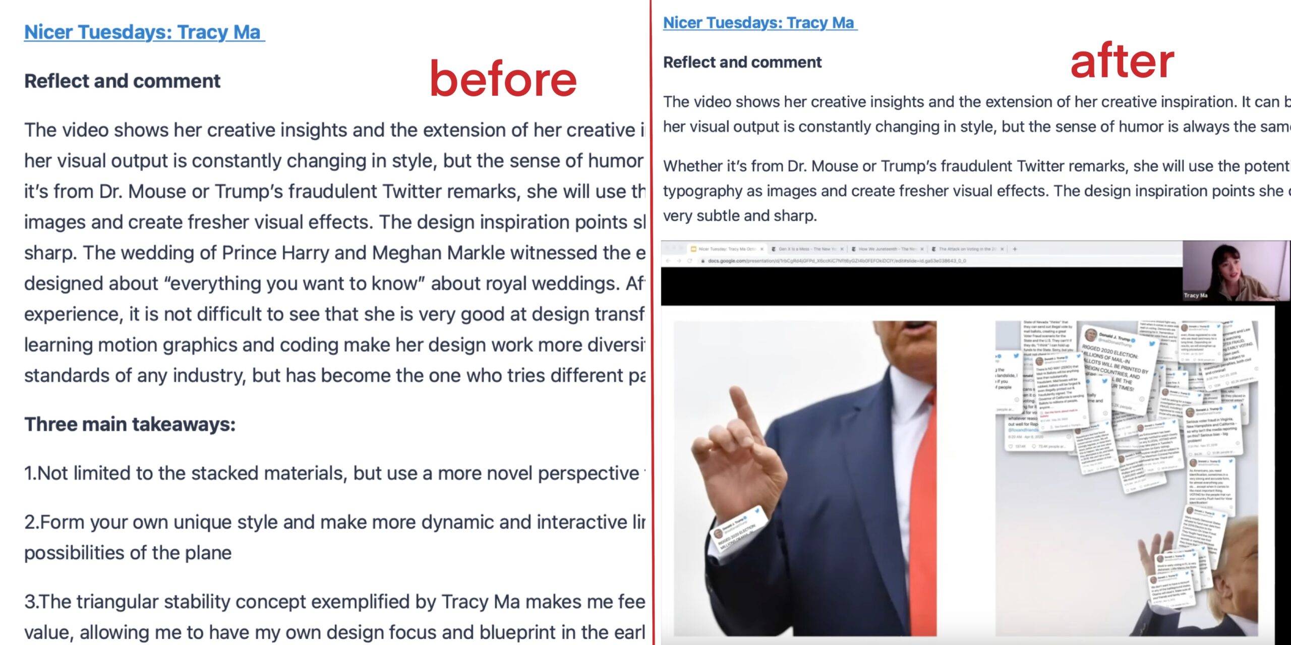
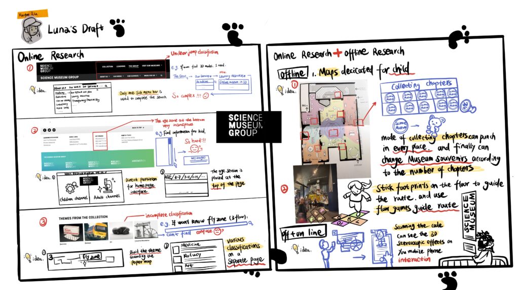
Brief 03 | Da NM Drawing Ideas

The design problems I chose is ‘get real’, which allows designers to come up with a way to encourage parents to stay away from mobile phones and spend more time with their children, so as to accompany their children’s growth. I drew the idea of this project with a pencil.

- RESEARCH

Preliminary research-01

The first thing we see is the first side of the first A3 paper. In the center, I drew a hole like crack. In the middle are the parents who are addicted to mobile phones and the children who are forgotten by them.

This side is about early research. The part in the upper left corner shows the importance of family closeness and its relationship with society.

Then come here to show how parents’ addiction to mobile phones leads to missing their children’s growth step by step. First, if parents play with mobile phones, their children’s spare time will be divided into three parts: playing by themselves, taking care of by grandparents and playing with friends.

Then it will lead to no words to communicate between parents and children, and then the final result is that children may have psychological problems due to lack of parental care, and resist being close to their parents at the same time.

So I listed the goals that the project wants to achieve, so that parents stay away from mobile phones, are more willing to communicate with their children, and interesting ways to promote parent-child relations.

The part on the right is a simple persona I made, which simply restores the family risk between parents and children due to mobile phones.

The reason why parents play mobile phones may be that they can’t find interesting things to do with their children. They want to have their own independent time and don’t know how to accompany them. It’s easy to forget time when playing mobile phones.

In the eyes of children, they may feel that their parents’ mobile phones are their parents’ children.

- IDEA GENERATION

20 brainstorming sessions-02

Then we can see the second page of the first A3 paper. In the upper left corner of this side, I drew a collage in the form of simple sketch.

Children cry because they lack their parents’ accompany. Parents and mobile phones are placed in the broken heart. This classic gesture shows that parents often lie to their children for reasons such as busy work.

Then I drew two concentric circles to show the leisure time that children and parents can coincide in a day. It’s usually around six to nine in the evening.
Then there is the part of brain storm. In the right part, I extended several ideas I came up with from the characteristics of children. Children are curious, so I think parents can make punch in question cards to interact with their children. 

For example, parents write down questions and then look for answers with their children, such as why the sky is blue, which arouses their children’s curiosity. At the same time, if it is on Saturday and Sunday, you can also make a clock in map of scenic spots and find it with your children in the form of treasure hunt.
Then children like games, and I found that many children like to listen to bedtime stories. So I thought of a storyboard game.This will be discussed later in concept development.

In the left part, I want to encourage them to stay away from mobile phones from the perspective of their parents. The first way is to occupy mobile phones., Use the mobile phone screen as part of the drawing game. For example, in this picture, the mobile phone screen shows this part of the animal, so according to the imagination, the child may draw the pattern of bird or duck.

The second method is mobile phone reminder. For example, you can put some pull-out notes in the mobile phone airbag bracket behind the mobile phone shell. The notes are wish lists that children want their parents to make with them. When parents want to open the mobile phone bracket to watch YouTube or other things, it will remind them to accompany their children.

In addition, a linkage device can be used to bind the mobile app to the device at home, so as to interfere with the time when parents continue to watch the mobile phone at home. This will be discussed later in concept development.

- CONCEPT DEVELOPMENT 1

Concept Development 1: Device+cell phone APP-03

Then there is the second A3 paper on the first side. This side further draws the idea of mobile phone and device linkage.

The first is the design of home device, which can be installed on the wall of the home. Normally, it is a lamp emitting warm yellow light, but it has a built-in sensing system connected to the mobile phone. When it is perceived that parents and children are in the same space, it will automatically connect the mobile app to calculate the time when parents watch the mobile phone.

The shape of this device is like an ear or germ. What I want to express is that the child is like a germ. We should always pay attention to his growth and listen to his voice at the same time.

The next step is to introduce the app function and interface linked with the device. First, this is the app interface, named “germination”. The first interface that pops up allows users to upload photos of their children, or they can pinch out a cartoon character similar to their children.

Then, when parents are not in the same space with their children, the app is not connected to the device.

But when parents and children are in the same space, it starts to automatically calculate the time for parents to watch ins and other software, and then there is a progress bar here. When the time of the progress bar is more than one hour, the software will automatically start the pop-up mode.

Pop ups are divided into two forms. The first is that when you look at the page, cartoon villains like your child will push the interface box to interfere with your mobile phone. Or jump out of the overlapping pop-up window like a virus to block your interface, so as to remind you to put down your mobile phone and accompany your children.

When it is detected that you are no longer looking at your mobile phone, the app also calculates your accompany time. These accompany time can be converted into water droplets on the app interface to water your little tree. The longer accompany, the closer the saplings grow to become big trees.

The upper right corner is a simple use process.

- CONCEPT DEVELOPMENT 2

Concept Development 2: Story chain game-04

Next is the second side of the second A3 paper. On this side, I introduced the storyboard game in more detail. The inspiration for this game comes from these factors in the left part.

First of all, children’s interest is to listen story and then parents are trying to understand their children. At the same time, the game can’t use mobile phones, while parents watch ins or YouTube through mobile phones to understand other people’s lives in most cases, such as some vlogs. Then the designed little game should be very simple and applicable to every day.

So combining these factors, I came up with such a story version of the game. The tools it uses are paper and pen, and the people are parents and children.

First, the parents give a background or a key word, such as’ in the garden ‘, and then the children give their own key words according to today’s experience, such as’ rope skipping, painting, cookie’, and then the children use their imagination to think about how to string their key words together into a fairy tale under the background of their parents’ key words. Similarly, conversely, children can also give their parents keywords.

This game can not only let parents and children understand each other’s life through the game, but also exercise children’s imagination. Then the game is also very simple and easy to understand, and can enable parents to transfer the part addicted to mobile phone content to their children and be interested in their children’s life. Finally, if the daily life is different, the stories will not be the same. Parents and children can also play the game of story Solitaire on this basis, so as to improve the freshness of the game.


Brief 02 | User_Group

This project is a team project. The museum we investigated is the 【Science Museum 】in London. We need to upgrade and optimize the museum’s online website to attract more tourists.

PART 1

First, it is the part of preliminary research. 

We believe that online museums and offline museums should be integrated. Therefore, we think that a field visit to the museum in London may be helpful to our investigation. Therefore, in this part, we combine the online survey and offline survey to compare them to find out what needs to be optimized and upgraded.

The figure on the right shows the jump process of the official website interface when we investigated the online museum official website.


The figure on the left shows the visual presentation of the number of tourists and other information according to the summary of last year’s Museum annual report given on the official website.

Summary of website pain points

In this part, we found some obvious problems on the official website of the museum, including but not limited to 【complex jump, unclear zoning, unclear key information, etc.】

Presentation of research board

In this part, we mainly focus on the information obtained by offline museums, and we extract the key information.

【1】According to the map of the museum, the exhibition hall on each floor of the museum is planned and positioned.
【2】Extraction and generalization of differences between online museums and offline Museums.
【3】 Answer board according to the staff of the Museum.

PART 2

In the second part, we use the user model to locate the problems to be solved again from the perspective of user psychology.


In this part, we made two personas to set up two roles, namely, mother and child.

And positioned their scene in the scene of seeking answers to questions in the online museum after visiting the offline Museum.

In this part, we draw the experience map of users’ psychology according to persona.

And summarize the problems they face according to the changes in their mood when they visit online and offline museums.

page-12

Solutions to web problems

This part mainly decomposes and solves the problems of the website.

Finally, according to all the research, we summarized the feasible ideas. And roughly planned the re layout of the museum’s online pages.

Group survey process chart and sketch display

PART 3

The third part is my personal research sketch in the project.

sketch

This team cooperation is a new experience for me. Being able to work together with the team members makes the progress of our project faster.

At the same time, because my undergraduate major is different from my current graduate major, I can better understand the steps involved in a complete project through this group project. These experiences are very useful for my personal projects in the future.

Blog 03 | Affordance

1.For the definition of affordance: 

The relationship between the object and the person (discover the function of an object, a collection of rich use performance on an object, can analyze its characteristics and let people understand how to use it)

                                                                           The afundance of “book”

“The value of a well-designed object is that it has a wealth of affordance, and people who use it can use it to do things that designers have never imagined.” This sentence made me feel very inspired. I can understand that the potential and value of the objects we design are unlimited in future applications. When we design, we may only think about a single purpose, but the user’s exploration of the object is beyond imagination.

Explanation of the affordance of Ipad:

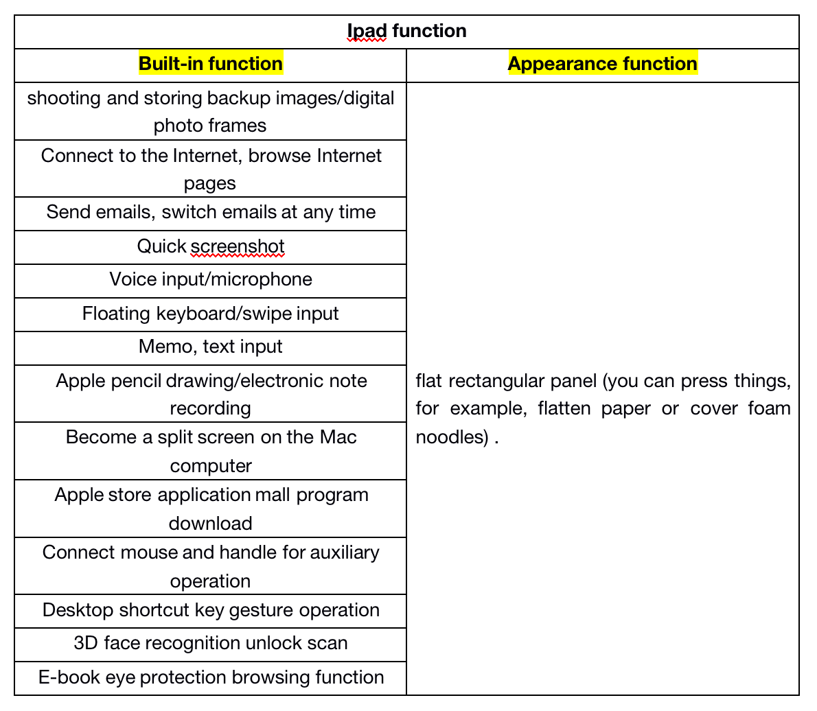
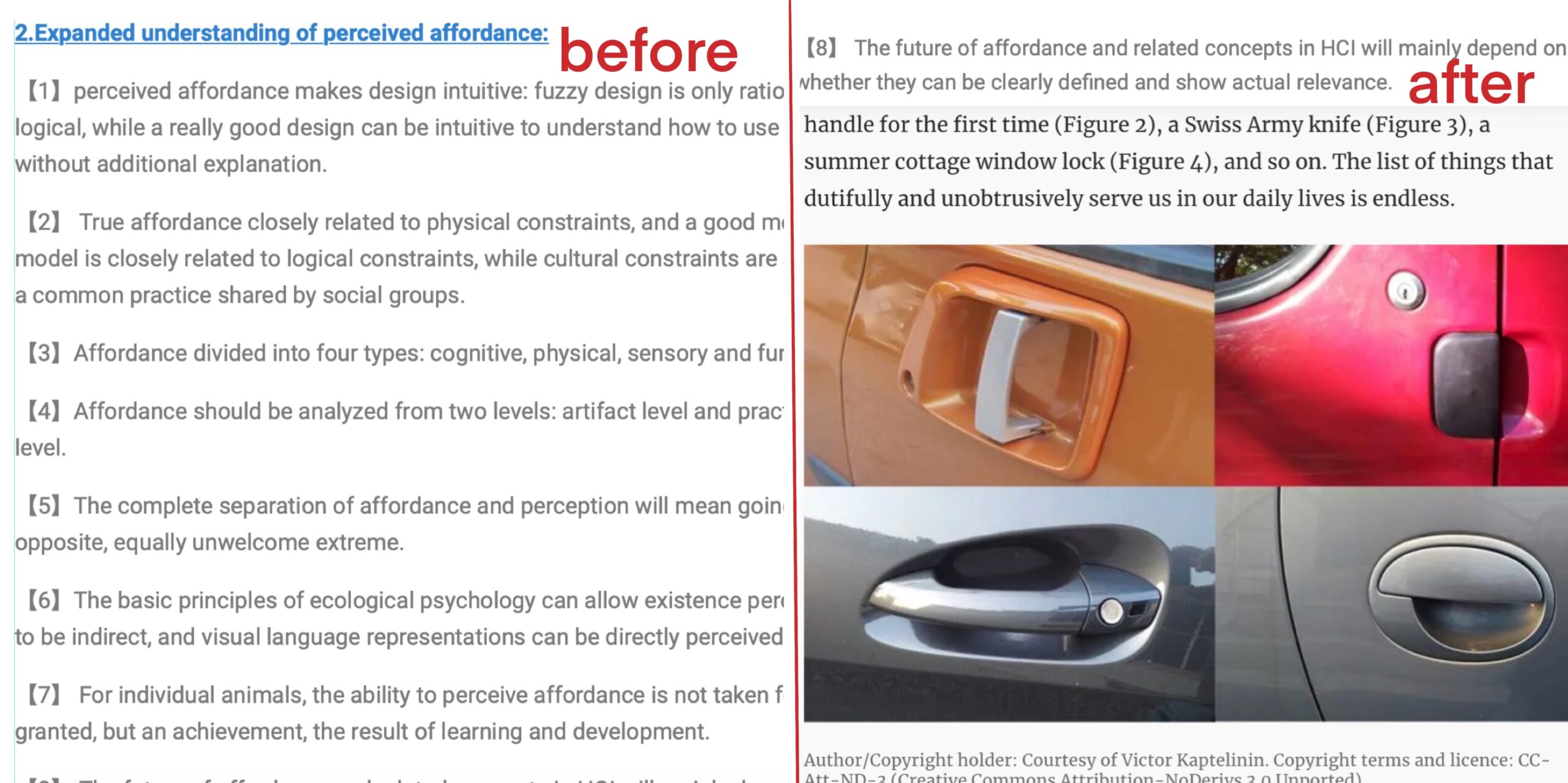
2.Expanded understanding of perceived affordance:

【1】perceived affordance makes design intuitive: fuzzy design is only rational and logical, while a really good design can be intuitive to understand how to use it without additional explanation.

【2】 True affordance closely related to physical constraints, and a good mental model is closely related to logical constraints, while cultural constraints are actually a common practice shared by social groups.

【3】Affordance divided into four types: cognitive, physical, sensory and functional.

【4】Affordance should be analyzed from two levels: artifact level and practice level.

【5】The complete separation of affordance and perception will mean going to the opposite, equally unwelcome extreme.

【6】The basic principles of ecological psychology can allow existence perception to be indirect, and visual language representations can be directly perceived.

【7】 For individual animals, the ability to perceive affordance is not taken for granted, but an achievement, the result of learning and development.

【8】 The future of affordance and related concepts in HCI will mainly depend on whether they can be clearly defined and show actual relevance.

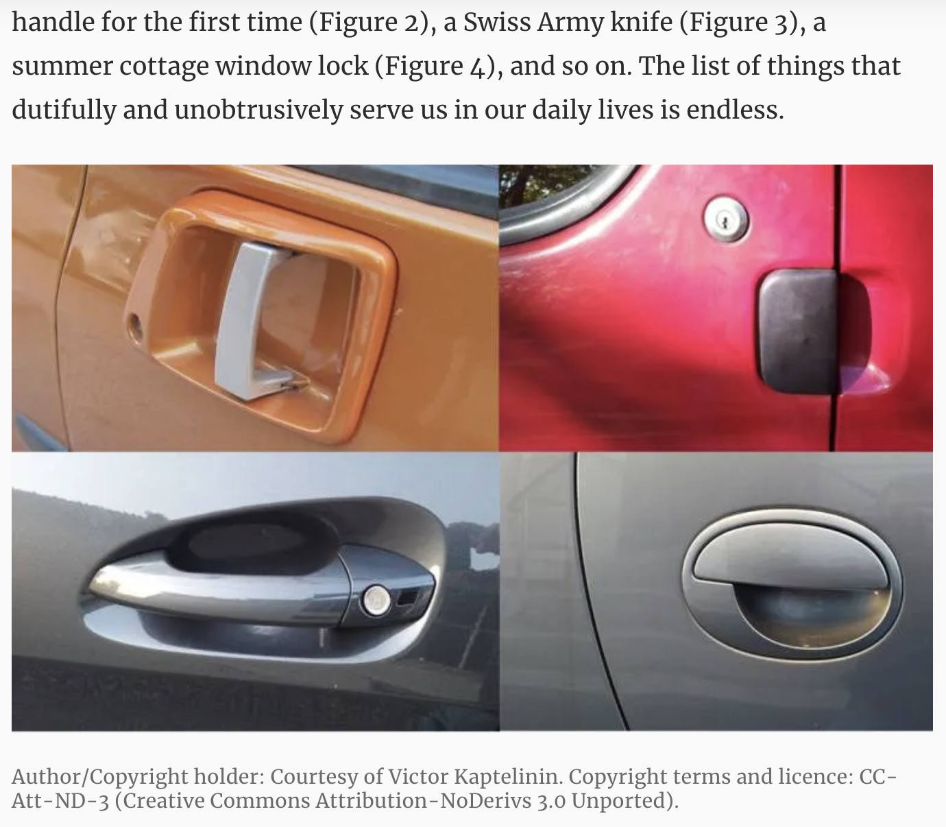
                                                                      User application of car handle

Blog 02 | BillVerplank

Bill Verplank’s speech:

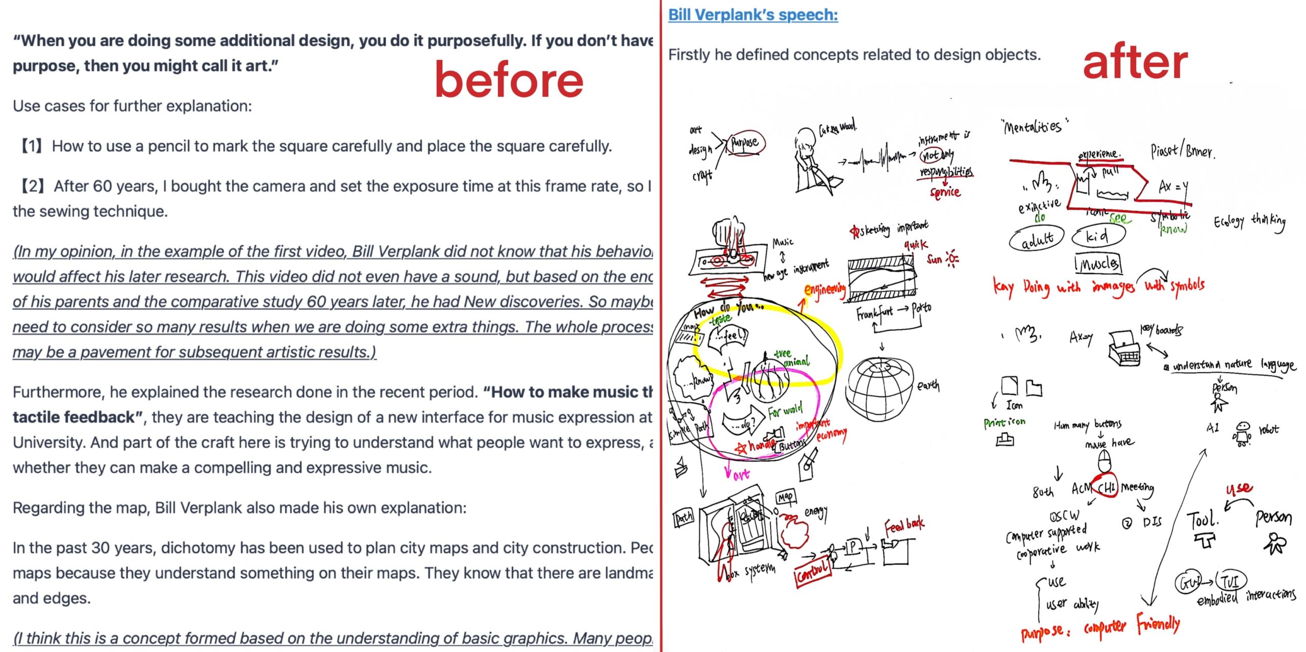
Firstly he defined concepts related to design objects.

“When you are doing some additional design, you do it purposefully. If you don’t have any purpose, then you might call it art.”

Use cases for further explanation:

【1】How to use a pencil to mark the square carefully and place the square carefully.

【2】After 60 years, I bought the camera and set the exposure time at this frame rate, so I completed the sewing technique.

(In my opinion, in the example of the first video, Bill Verplank did not know that his behavior at the time would affect his later research. This video did not even have a sound, but based on the encouragement of his parents and the comparative study 60 years later, he had New discoveries. So maybe we don’t need to consider so many results when we are doing some extra things. The whole process of behavior may be a pavement for subsequent artistic results.)

Furthermore, he explained the research done in the recent period. “How to make music through tactile feedback”, they are teaching the design of a new interface for music expression at Stanford University. And part of the craft here is trying to understand what people want to express, and consider whether they can make a compelling and expressive music.

Regarding the map, Bill Verplank also made his own explanation:

In the past 30 years, dichotomy has been used to plan city maps and city construction. People have maps because they understand something on their maps. They know that there are landmarks, paths, and edges.

(I think this is a concept formed based on the understanding of basic graphics. Many people will understand the meaning of the “p” sign on the parking lot when they see it.)

Bill Verplank has developed a complete vocabulary so that users can have a description system that clearly describes map concepts.

It further leads to the question “What are the other things we consider in the design?”:

Take the Caleb Kiss St interaction, for example, explaining that images are a very important influencing factor. Different visual symbols affect iconic visual thinking.

(Through Bill Verplank’s sketching and explanation, I can better understand his working status and projects, and at the same time know his new understanding of the application of interaction design in various industries.)

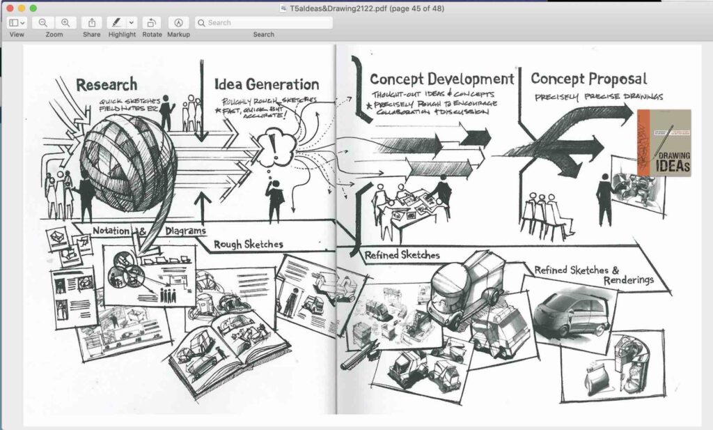
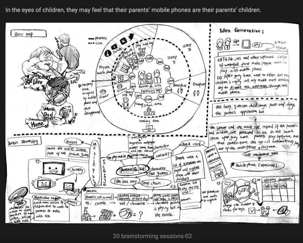
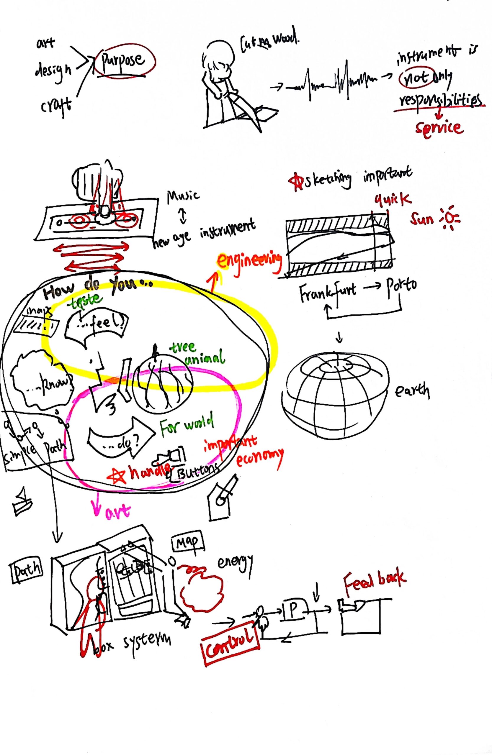
For the sketch book, I also made a brain map. To define how to use the complete sketch to explain the concept you want to express.

                                                                 Sketch understanding of brain storming

Blog 01 | Ideas

Avatar Robot Cafe

Reflect and comment

1. For people with disabilities, they have experienced their social and life values.

2. For society, public welfare projects caring for the disabled can arouse the attention of public opinion, re-emphasize the employment of the disabled, and allow people to reflect on the value of each person in society.

3. For the public, the novel remote control and the reemployment of the disabled can easily arouse people’s interest.

4. For the field of science and technology, the research and development of robots has achieved a sinking market implementation. With the development of science and technology, more possibilities are reflected. From the original program control to today’s eye tracker non-touch mode robot, these have witnessed the successful digital transformation after the germination of the design concept.

5. For the company, the newly created forms of employment and jobs allow emerging industries to have more consumer markets. While bringing real benefits, the later employment of disabled persons also reduces the company’s work space and space expenses. A benign cooperative and cyclical relationship has been formed.

The two projects in the picture below are also design transformations that use the same concept:

                                              Alzheimer’s disease patient restaurant (Japan)

                                                                                  Deaf Café (China)

Three main takeaways: 

1. Return to conception and use design empathy to solve problems.

2. Make a good idea of design concept transformation and landing

3. From multiple perspectives, improve the bond between society, enterprises, design audiences and the public.

Nicer Tuesdays: Tracy Ma 

Reflect and comment 

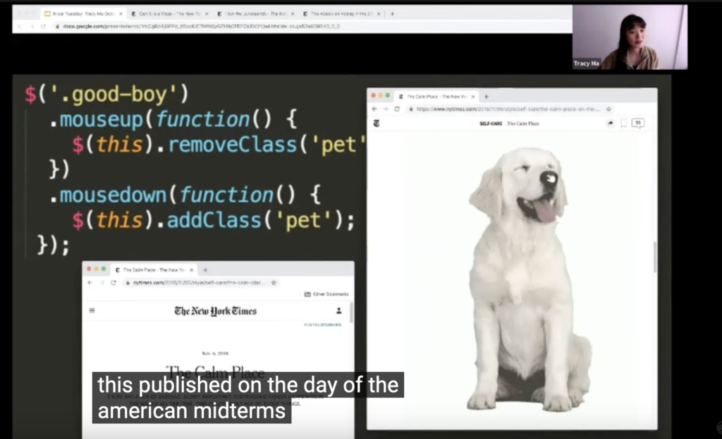
The video shows her creative insights and the extension of her creative inspiration. It can be seen that her visual output is constantly changing in style, but the sense of humor is always the same.

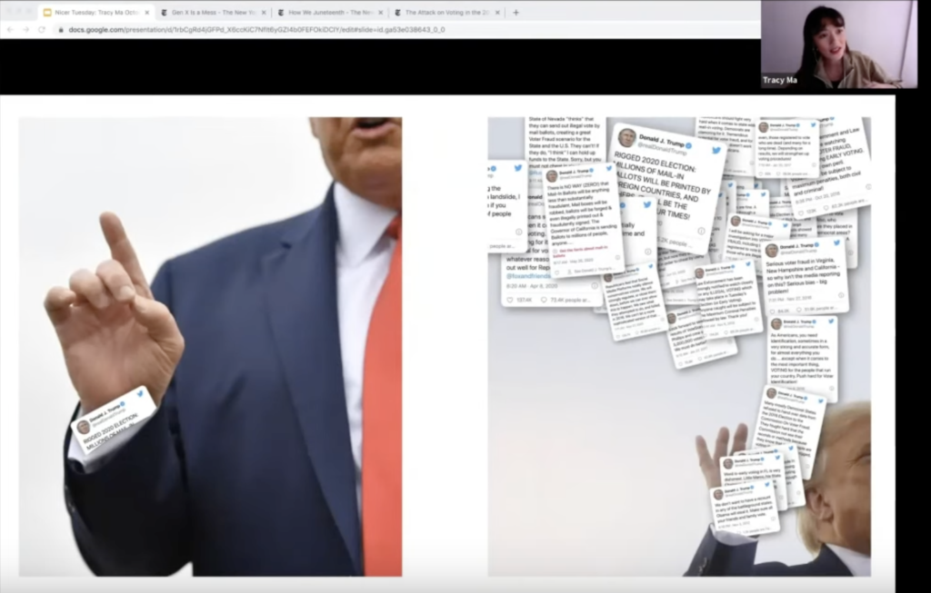
Whether it’s from Dr. Mouse or Trump’s fraudulent Twitter remarks, she will use the potential of typography as images and create fresher visual effects. The design inspiration points she cut into are very subtle and sharp.

                                                                          Trump’s pop-up virus

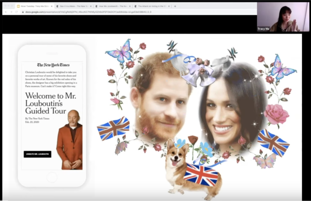
The wedding of Prince Harry and Meghan Markle witnessed the extensive and funny FAQs she designed about “everything you want to know” about royal weddings.

                                                             Interesting British Royal app interface

After learning about her past experience, it is not difficult to see that she is very good at design transformation! Her self-taught self-learning motion graphics and coding make her design work more diversified.

                                                        Made by human-computer interaction and code

She is not limited to the standards of any industry, but has become the one who tries different paths.

Three main takeaways: 

1.Not limited to the stacked materials, but use a more novel perspective to understand the design 

2.Form your own unique style and make more dynamic and interactive linkages become the emerging possibilities of the plane 

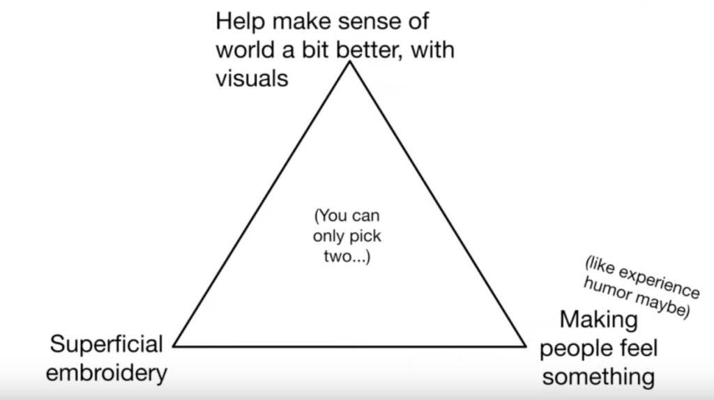
3.The triangular stability concept exemplified by Tracy Ma makes me feel that it has great reference value, allowing me to have my own design focus and blueprint in the early stages of design.