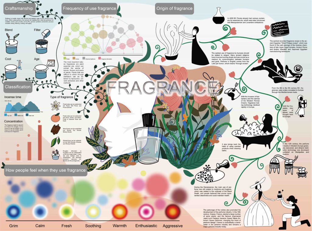
The theme of my project is perfume. In this project, I present some related information such as the development history of perfume, the production process, the classification of fragrance notes, and the feelings of users.
Background
We are in an era of measurement from external commercial forces, big data and surveillance.
Under the package of data flow, how should people reflect on themselves, where is the boundary between virtual and real space, and how to better digest and absorb these increasingly expanding information, data visualization methods may provide us with better s help.
Context
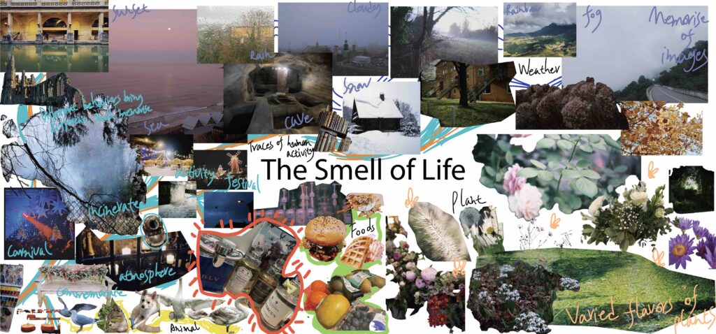
Smell is an integral part of people’s daily life, and it can sometimes evoke synesthesia in people. Smell can make people recall a memory, or associate a certain scene, and smell can also affect people’s preferences. Among them, the compound and portability of perfume brings more possibilities for people’s choice and feeling. The project is based on the theme of perfume. It not only introduces the knowledge of perfume to people through the means of data visualization, but also reflects people’s different feelings about various smells.
Research
After I settled on the theme of the project, I conducted a series of researches.
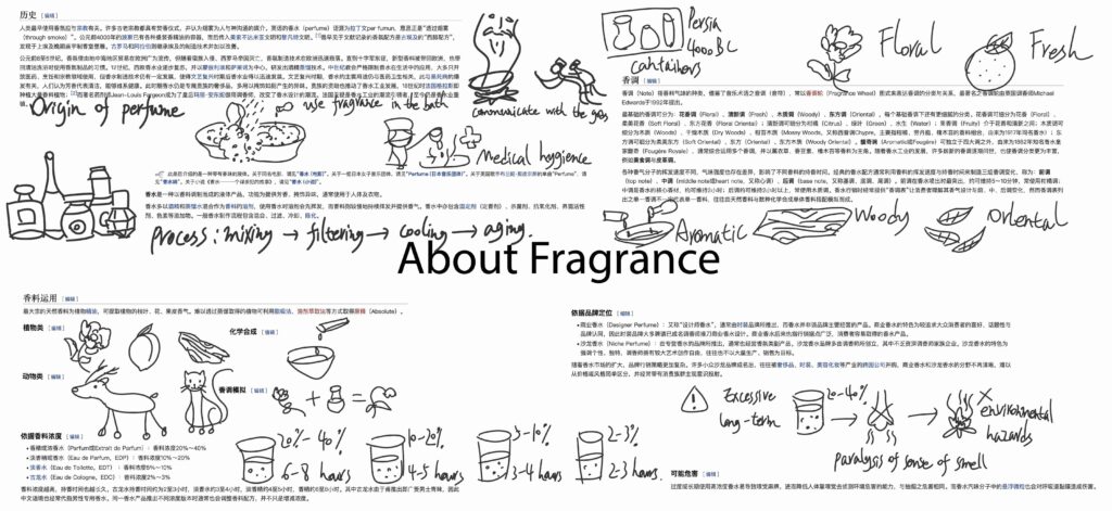
It was also after a series of research on scents that I decided to use fragrance as the core element.
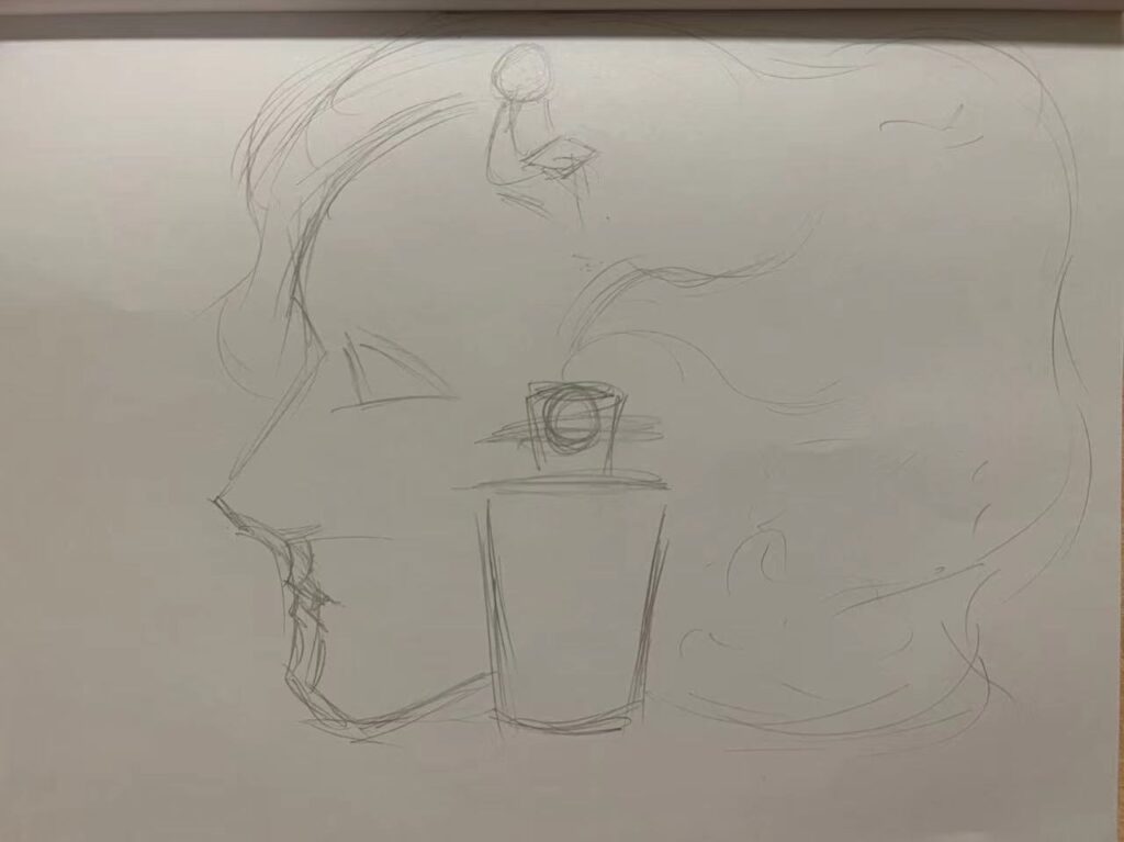
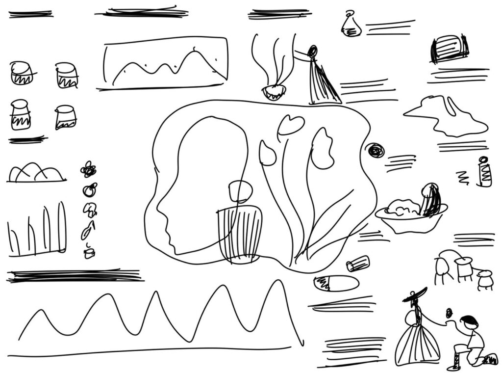
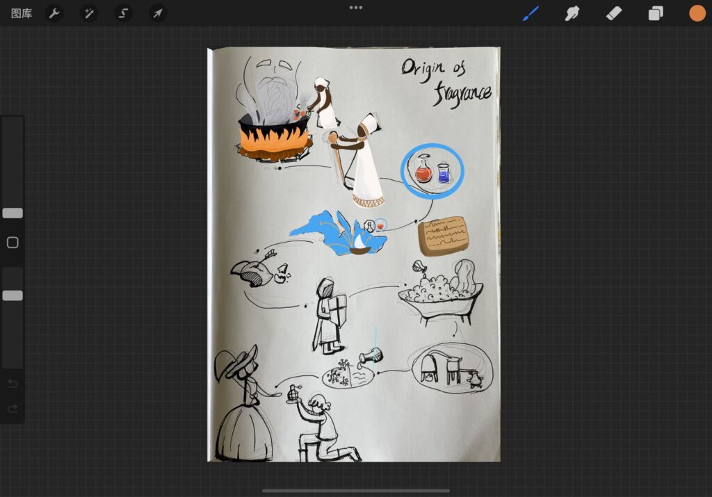
After that, I researched the knowledge about perfume and made some simple sketches in the process of understanding the information.
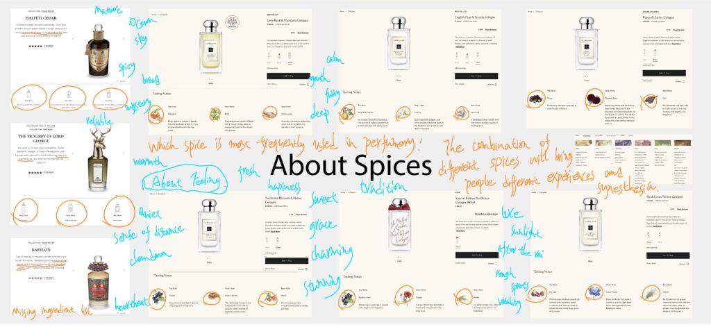
Originally I intended to focus on spices and count the frequency of their use and how people feel about them, but as the information was too heterogeneous for me to complete such large statistics in time for this short project, I eventually decided to base the data on some of these typical representatives and create a data visualisation.
Sketch
After several attempts and modifications, I found a more suitable visual presentation.
Summarize
In some cases, graphics can help people understand and remember information better than words, and data visualisation is a way to carry and communicate information in a more intuitive and understandable way.