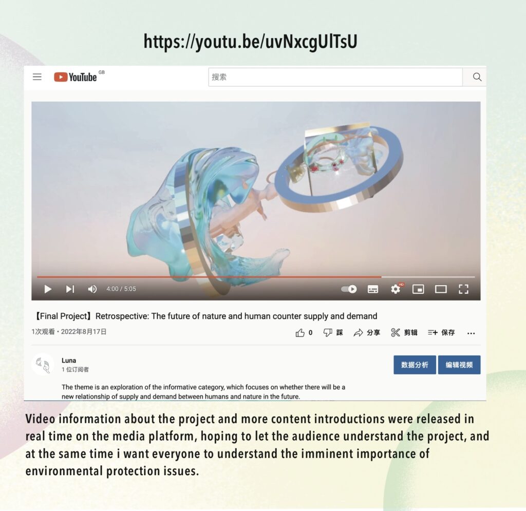
The theme of my graduation project is ‘Retrospection‘, which is a topic based on the after the New Normal.
It is a project that explores the question of whether there will be a new relationship between supply and demand between humans and nature in the future. The aim of this project is to use satirical visual art to make people aware of the importance of nature.
Video introduction
Preliminary Research
First Page
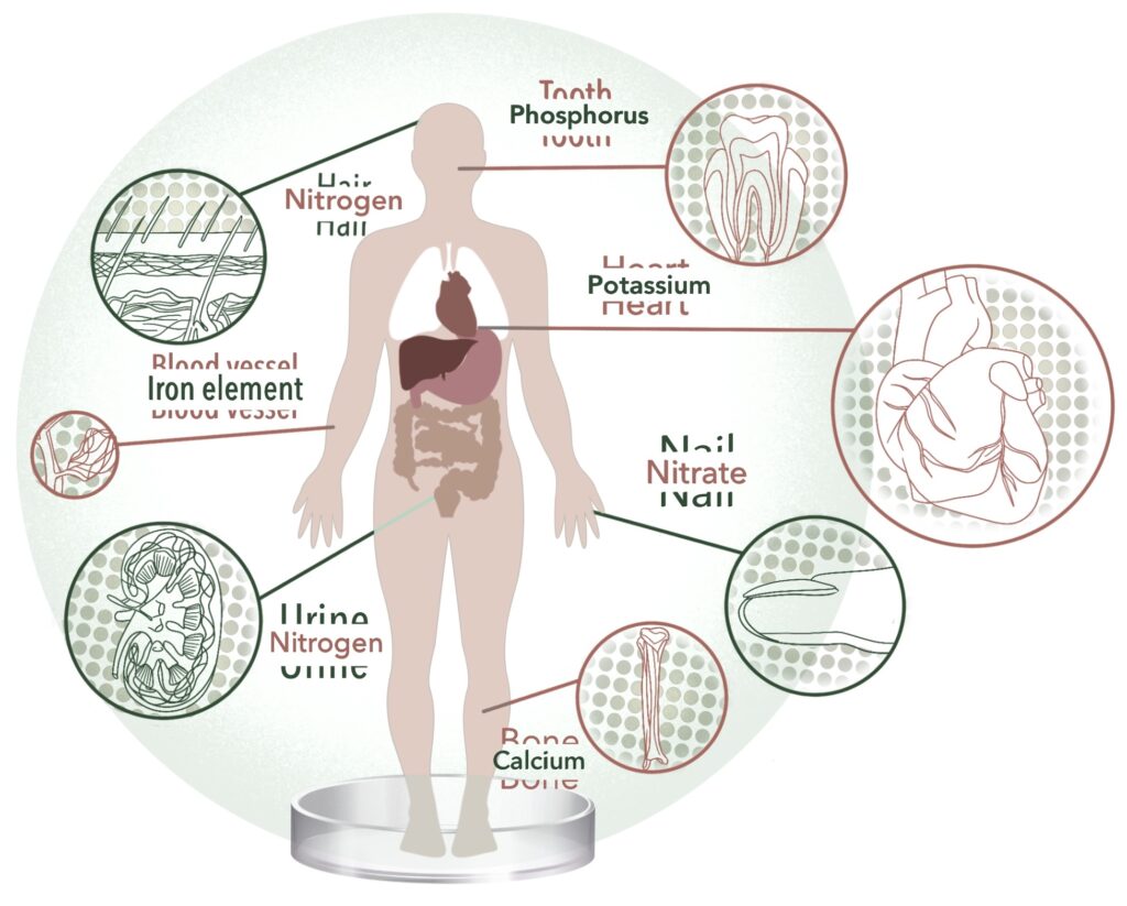
The Encyclopedia of World Problems and Human Potentialists the types of natural resources that are currently in short supply around the world. Combining this with the data from the BBC News website on the six major resources that will be drastically reduced in the future.
Research 01 -Background to the natural crisis
Although we have always stressed that humans and nature are equals, in reality we are still taking more than we can protect. So, based on this data, I have created a visualisation of the relevant data.
Second Page
The real-life examples confirm that there is an overlap of needs between humans and plants.
For example, plants get their nitrogen from human hair and urea from the urine excreted by the human body. The close correlation between humans and plants makes it possible for humans to supply plants in turn.
Research 02 -Interoperability of human and plant nutrient needs
Based on this reality, I show the overlap between the nutritional needs of plants and human tissues in a more extreme way, by visualising that plants can act as absorbers to absorb human supplies.
Third Page
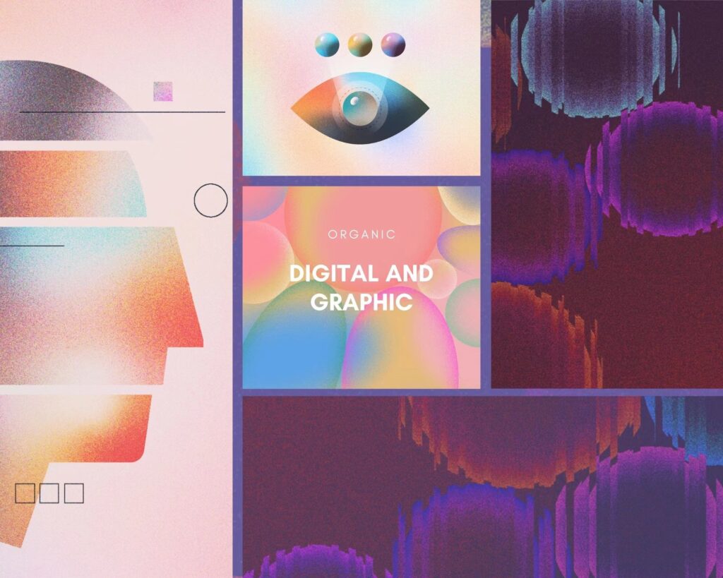
Research 03 -Mood Board
I then collected the work of artists such as French artist Stephanie Kilgast whose sculptures show the fusion between nature and humans in a strange collision of a post-apocalyptic feel.
These artists’ works explore the relationship between man and nature, and my mood board is based on this, extracting key words such as ‘reverse supply, irony, virtuous circle, distortion, symbiotic relationship’ to guide the direction and style of my project.
Fourth Page
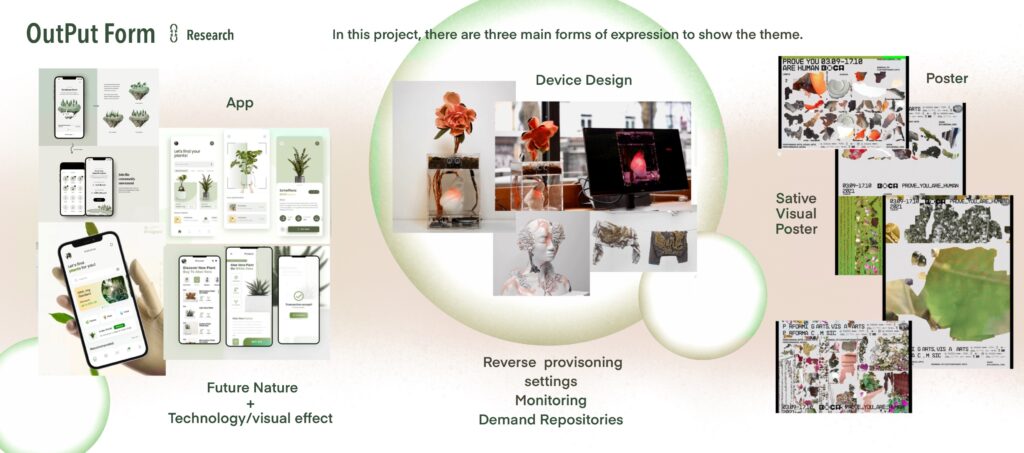
Research 04 -Output Form Define
On the fourth page, I conceptualise the form that my project will eventually take. Probably an app concept for connecting plants and humans. Then a device for energy conversion and a visual dynamic poster.
Blue Print
First Page
Blue Print 01 -Brain Storm
On this page I made a blueprint for brainstorming. In this section I used William Morris’s research techniques and did some experiments with graphic transformations.
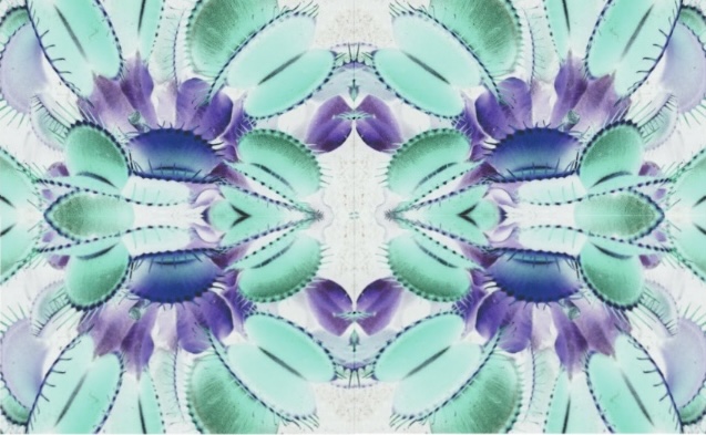
Mimosa pictorial design
Flycatcher design
Flycatchers and mimosas are both plants that respond to human behaviour, so I showed them both as two graphic patterns. And I wanted to explore the future of plants that might actively communicate with humans.
Second Page
Blue Print 02 -Evolution
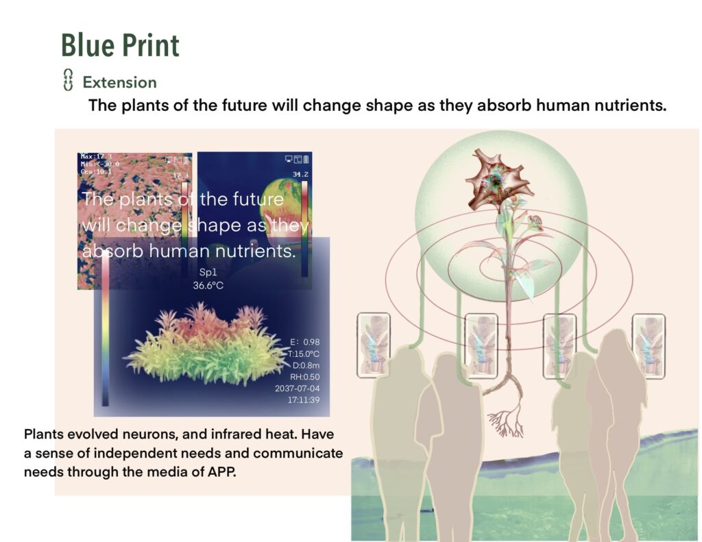
On this page , I have made some assumptions about a future plant that has evolved as a result of absorbing humans.
For example, it will have the heat-sensing body temperature of a human, its branches and leaves will become as hard as a human skeleton, and most importantly the roots will be encased in an embryonic sac so that it can be readily removed from its soil environment and absorb nutrients from the embryonic sac, just like a human baby.
The plant’s flower core will evolve into a nerve that can communicate its needs to humans through subsequent applications.
The object of my character is the plant of the future, and a series of ideas based on the plant of the future are made.
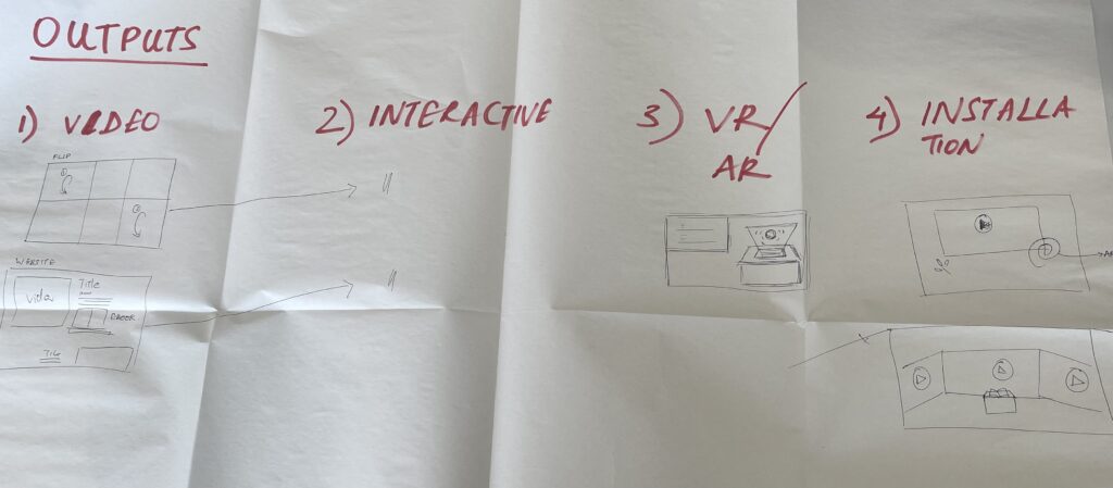
Output
First Page
Output 01 -Process
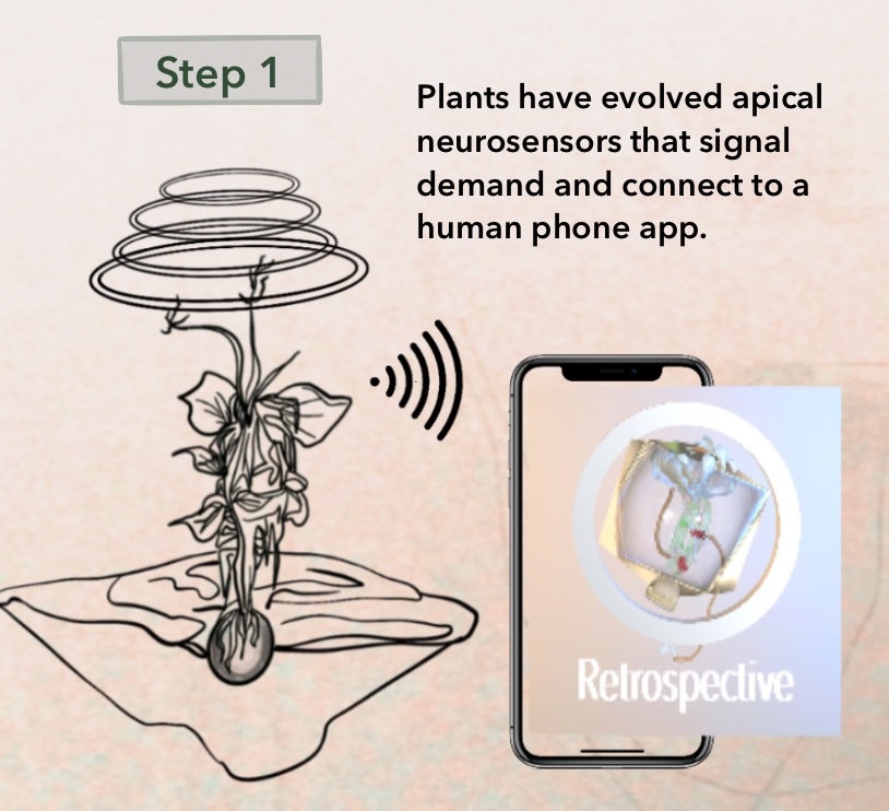
A complete flowchart is then shown on this page , where the device receives information from the plant and communicates it to the human, followed by the whole process of nutrient delivery back to the human, similar to the energy conversion in a hospital scenario.
Second Page
Output 02 -Experimentation
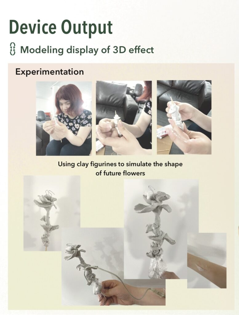
Based on my vision, I experimented with shaping the future plant in clay.
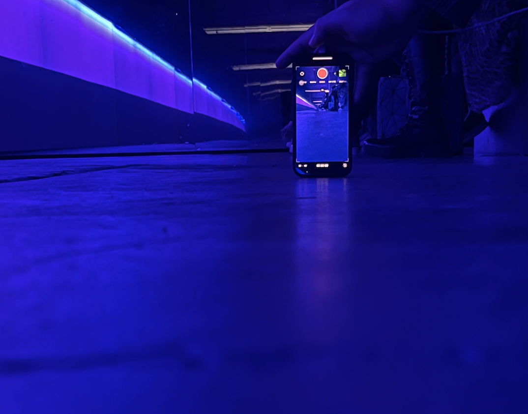
I modelled it using 3D modelling software, and what the video shows is a rotating display of my 3D modelling. This is a demonstration of my idea for the device.
Third Page
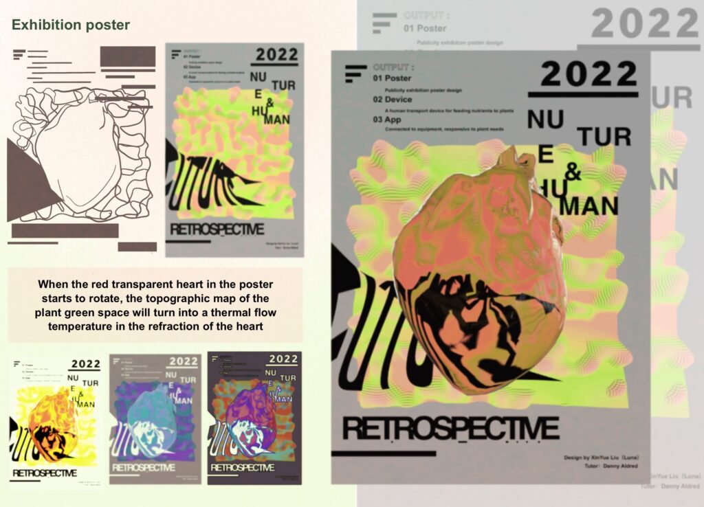
Output 03 – Poster
On this page I made a visual kinetic poster display, I was mainly inspired by the topographical map, the heart and the heat sensing map. On page 8 I made a visual kinetic poster display, I was mainly inspired by the topographical map, the heart and the heat sensing map.
In the middle of the poster is a transparent heart, and as it rotates, the plant topography in the background of the poster takes on the effect of a heat-sensitive map of the human body.
AR display
I then combined the model with reality composer to show the interactive effect of the ar, allowing it to be widely used on social media platforms.
Social Media
Finally, I have put together a video of my project and posted it on social media in the hope that it will draw widespread attention to the relationship between humans and nature.
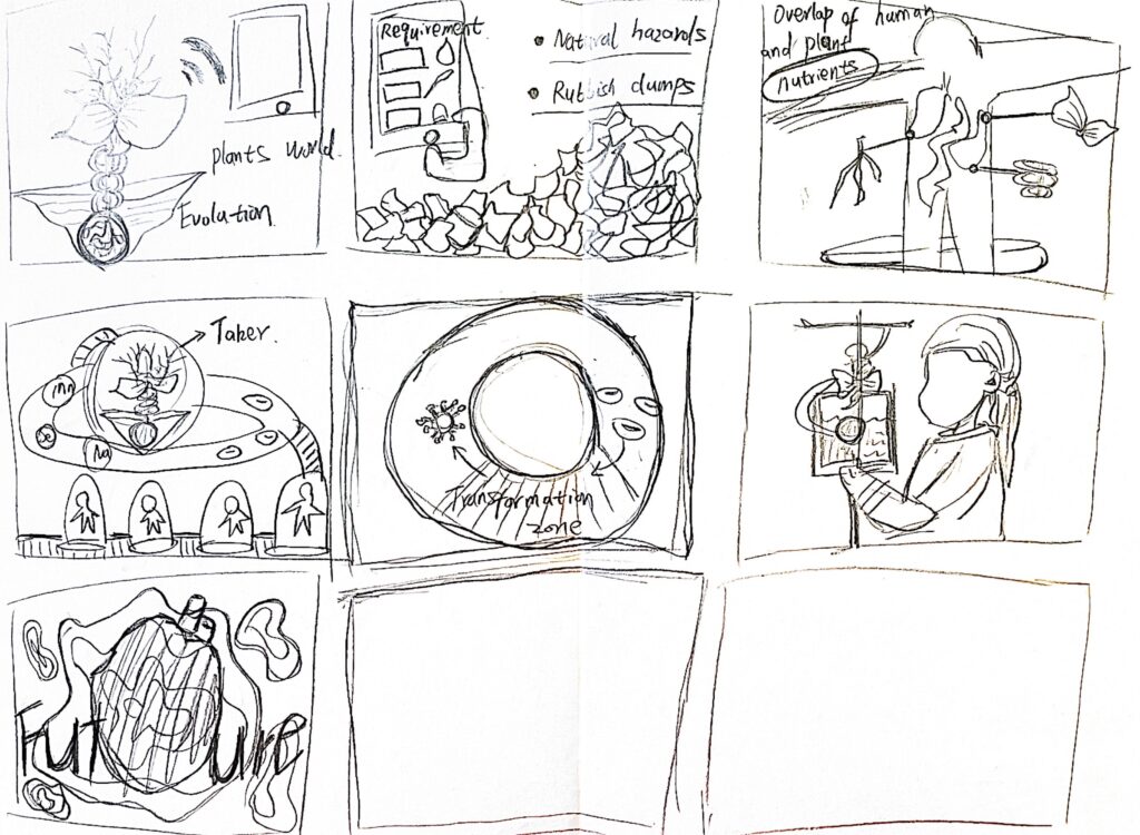
Process
Draft
Story Board
Preliminary sketch idea
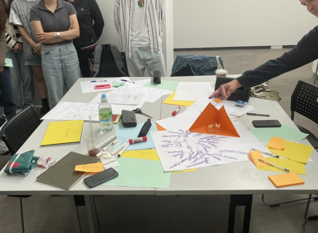
Work Shop
This final design has improved my design skills and creative thinking in a number of ways.
Firstly, the weekly lecture sessions we organised and the workshop sessions afterwards have helped to inspire me in a new and creative way about my profession.
Reflection
By reflecting on this design process, I think there are aspects that I can still improve on in the future.
For example, could the energy conversion device in my design concept have been designed with more detailed conversion channels? And can the 3d-printed modeling be as good as expected? As the content is now mainly electronic and the medium of communication is online streaming, perhaps a physical and interactive device would have more resonance and empathy with the audience if there was an offline visual presentation later on.
Project 4 is centred on exploring the image of the museum of the future in 2075 and how it might operate.In this project I explored new forms of exhibiting and new ways of navigating online museums.
The museum I was assigned to was The National Science and Media Museumin Bradford.
Preliminary Research
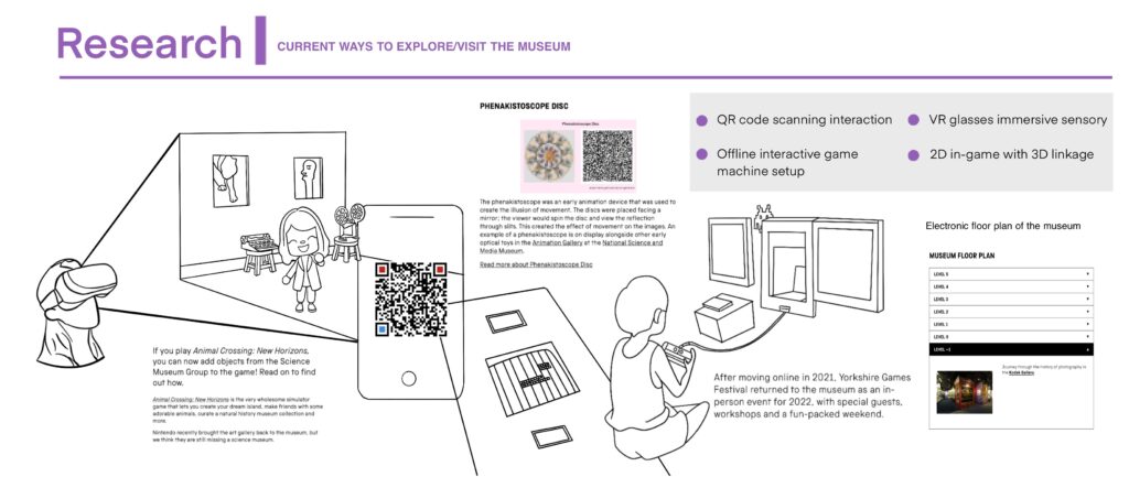
Research 01 -Research on existing museum pavilions and presentation
Firstly, on the first page, I researched the smart interactive installations in the museum. As there is a games festival in the museum in the first half of 2022, many parts of the venue are set up with different types of games for visitors to interact with, as well as VR glasses to wear for the experience, and QR codes that when scanned link the exhibits to the art pavilion in Animal Crossing, a steam game.
The existing interactive installations and the layout of the museums show that interactivity between exhibits and visitors has been given a high priority.
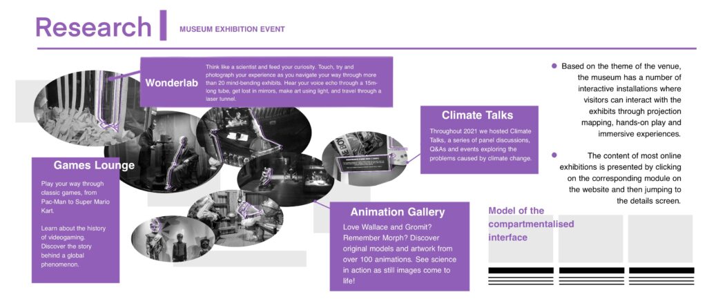
Research 02 -Museum exhibition themes in a nutshell
On the second page, I have summarised the different themes of the exhibitions on each floor of the physical museum, and then briefly analysed the online museum’s web tour format.
Research 03 -Museum key group orientation
On the third page, I wanted to identify the main groups of people who would visit the museum. I targeted children and families as the main audience. The key messages extracted from the reviews of visitors who had visited the museum through Google map, most of them mentioned key words that were suitable for taking children, or for children at different stages of life. Combining this with the text of the images provided on the main museum website and the actual offline venue, the number of visitors with children accounted for around 70% of the visitors.
Research 04 -Thinking based on eight questions
On the fourth page, I have answered and analysed John Stack’s eight key things, and combined this with literature on the future of museums to identify a key direction for future ideas, which is to focus on children and families, and to develop ideas based on a variety of content formats, open spaces, and immersive and fun experiences.
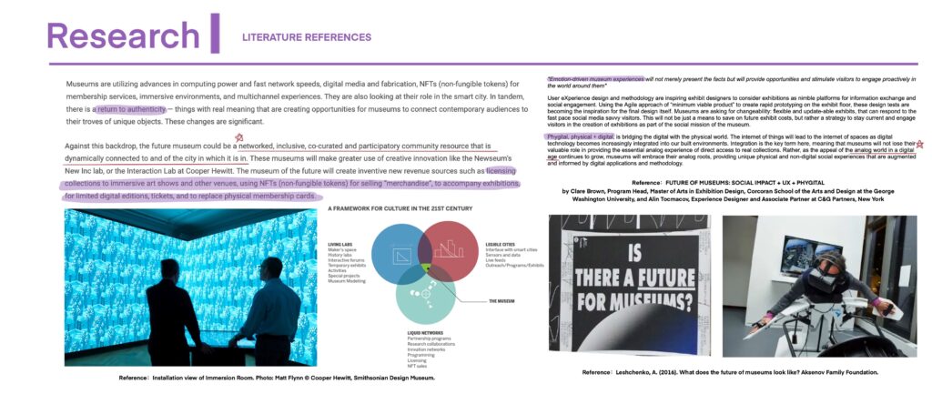
Research 05 – Literature references
The fifth page is based on the above research, and finds some literature in the school’s electronic library that can support the extension of my subsequent ideas. I have taken some key passages and extracted the key words immersion and fun.These two words will be implemented in all my ideas for the future museum.
3 Idears
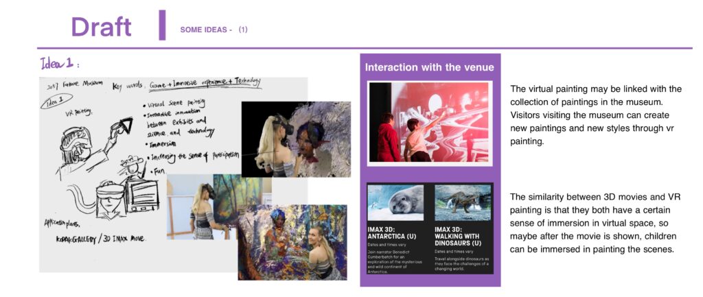
First 1:
Draft 01 – VR Painting
Firstly, the first idea is to use the technology of vr drawing to simulate a virtual reality environment that can be interacted with the 3d cinema in the venue as well as the gallery. With VR eyes on, interactive drawing can be done interactively through a handle.
Second 2:
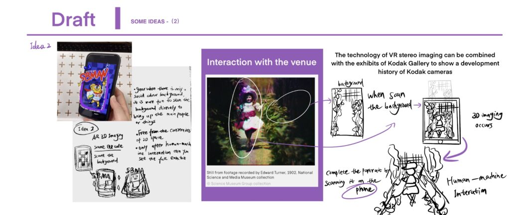
Draft 02 – 3D Painting
Secondly, the second idea is that the virtual three-dimensional approach of AR’s augmented reality can be used to scan artworks. This would allow the full exhibit to be seen out of the confines of two-dimensional space and only after human-machine interaction.
For example, in the photo on the right, taken by Kodak in the science Media Museum collection, if the work is displayed with only the background, and the visitor scans it, a three-dimensional figure will appear in the phone, enhancing the sense of virtual reality.
Display – 3D Painting
For this part, I will use a visual effect that I have made to reflect this. Firstly, I have drawn the collection in layers in the form of paintings, after which they are arranged in layers together. Using a 3D spatial effect, the flat painting was made three-dimensional. Secondly, I imported the code so that this image could be detached from the initial machine. This means that when I take a picture with the camera lens of my ipad, with my phone behind it, I can see the image I drew become a 3D image on top of the phone in three dimensions.
Display Video – 3D Painting
Third 3:
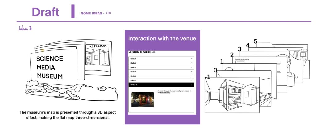
Draft 03 – 3D Guid map
The third idea was to re-imagine the presentation of the online museum map. The current map is only graphic and does not give a sense of immersion.
In this section I made an animation to show what I was thinking. I drew the museum in lines from level -1 to level 5 and then used a depth extension effect where the content of the next level can be seen through the hollowing out of the previous level, so that layer by layer it is like a first view into the museum.This enhances the sense of immersion as the museum of the future can be attached to any electronic device.
Display Video – 3D Guid map
Reflections
When working on the whole project of conceptualising the future of the museum, I think one of the bigger difficulties I encountered was that I had difficulty in thinking completely creatively. A lot of the inspiration is based on existing technology, which may make it easier to implement the project. But this is a vision of the future, and anything is possible in the future, and museums can take on a whole new role beyond the constraints of time, place, medium and so on. In terms of opening up the mind completely, I don’t think I’ve done that, I’ve just done what I can think of at the moment.
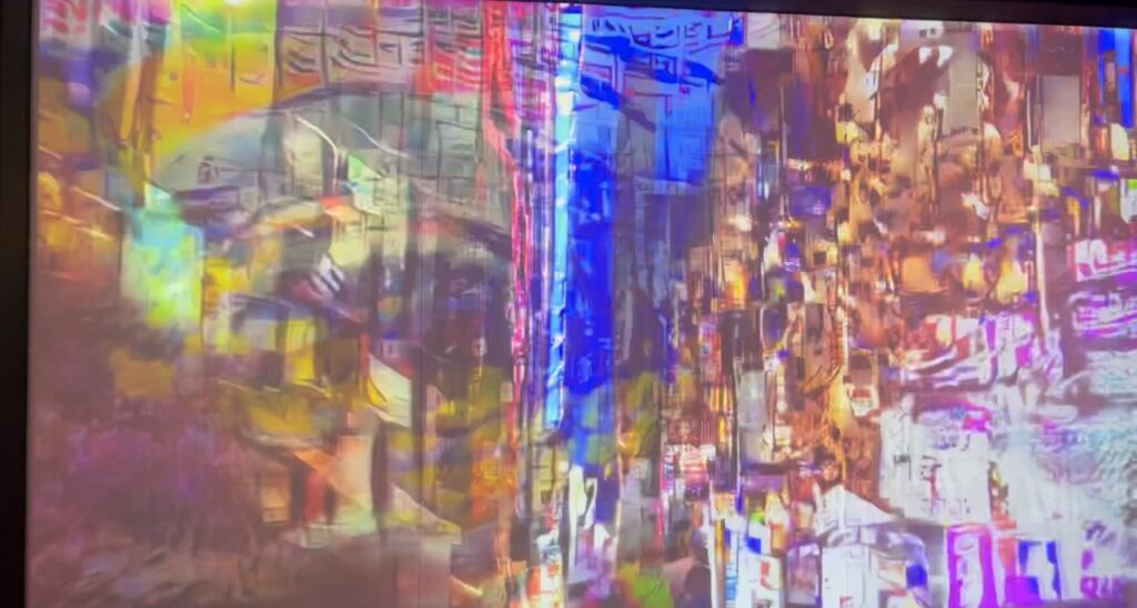
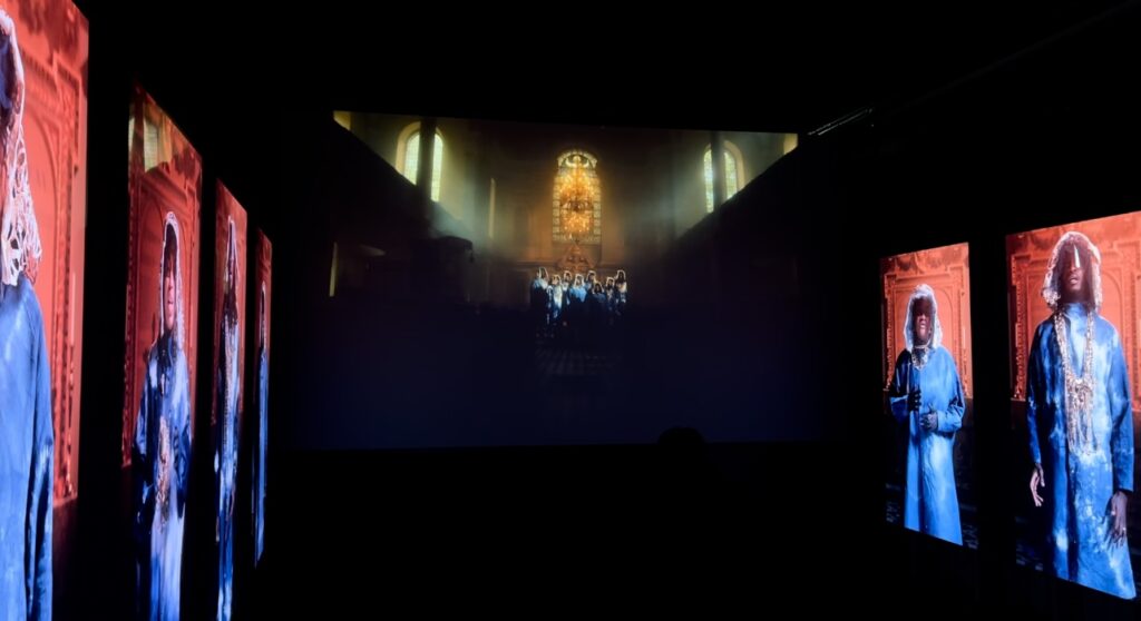
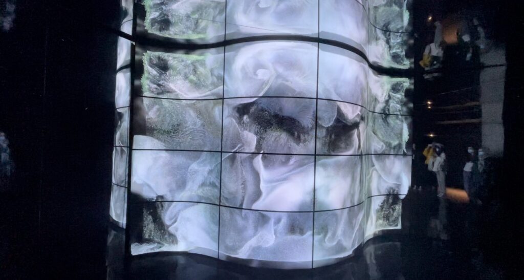
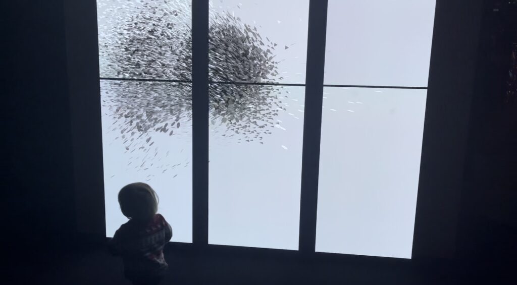
LUX: New wave of contemporary art in London, an immersive interactive design exhibition curated by SUUM in collaboration with Fact and 180 Studio.
I think it was a great success as it brought together 12 artists who used immersive art to blur the boundaries between the physical and virtual worlds. The whole exhibition was filled with light and sound effects, the constantly changing folding screens and the total immersion experience were what I found so successful.
All of the experimental art installations use cutting-edge digital tools (3D projection technology, quantum computing, game engines, etc.) to achieve the most immersive visual effects, exploring the relationship between light and perception and between man and nature and technology.
My favourite is this work by A’strict Starry Beach. A surreal space to feel the surging waves under a starry beach. With the sound of lapping waves, the waves projected on the wall are punctuated by dots of luminescence in a unique visual rhythm against the pitch black environment. And the installation is the last of the azure ones, giving the impression of feeling the virtual waves churning in a slightly exhausted and unfulfilled state.
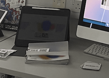
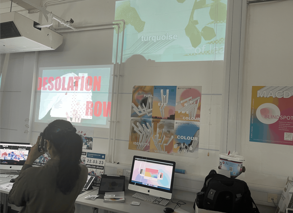
The final exhibition was presented, and members of our group prepared for it for several days. It includes booking the rental equipment of the media store, printing posters, testing web pages, publishing ins, and arranging specific booths.
Process
-Equipment test
First of all, the equipment we want to rent ipad (for playing carousel web demo videos), computer (for showing the full web interface), projector and speakers (for playing the main video of the project). After making an appointment for rental, we tested these devices, and finally found that due to the old version, it could not support the effect we wanted to present.
After changing the model and adjusting the position, the content of some groups was presented.
-Physical content preparation
We uploaded the posters to snowhite’s website for printing. For a series of six posters, we printed one A3 copy of each of the six posters. For the exhibition posters, we printed two copies of A2 size and cut them.
We were a group of six members, most of whom had e-books, no physical books. So we put the focus of the exhibition on the online display.
-Final display
In the final display part, we will display part of the interactive content on the ipad and computer. The colors of the overall project are based on the three primary colors of red, yellow and blue.
Other sections/Reflection
The Instagram part was not shown in the final work exhibition. This part is also the part of social marketing that we want to show.
In the exhibition section, I think our physical content is a bit low, which is not quite enough for a physical exhibition. Printing multiple copies of the posters and overlaying them as well as adjusting the brightness of the projector light might have made our overall content look more substantial.
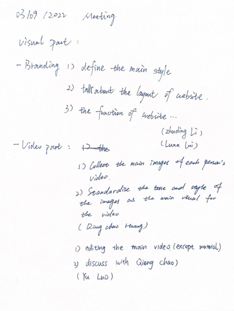
In brief 3, we will be divided into small groups where members of the group are assigned the same poem, and we will work as a whole unit to package and reintegrate everyone’s work.
Online meeting + offline meeting
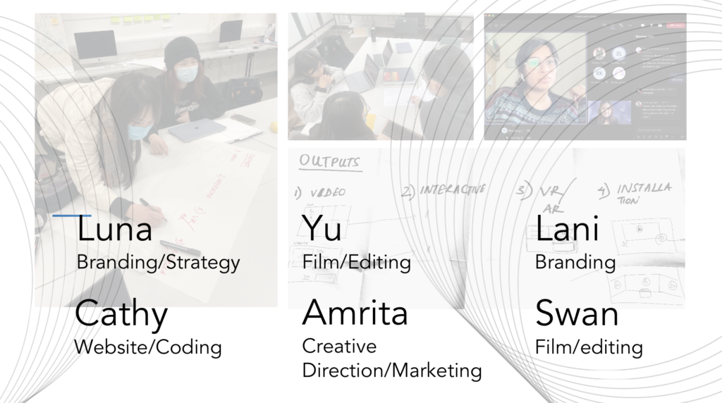
Division of work among members
We had about six meetings in total, and the specific division of labor among members was determined in offline meetings. The online meetings mainly helped us to assist in communication and to check the progress between members to avoid disconnected content or inconsistency in overall style.
communication process
During the preliminary discussion phase, we decided to promote and integrate our books in a form of online marketing. Since most of us have books that are online and do not have a physical book component, the online website build will be one of the main means of presenting our work. At the same time, we have determined that the media part of our work will be promoted by posting on YouTube and Ins.
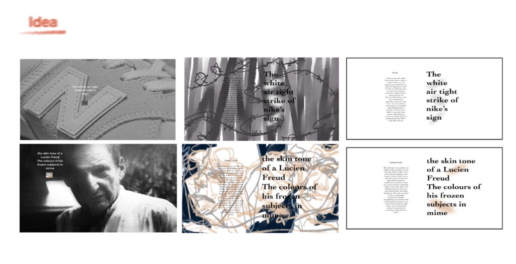
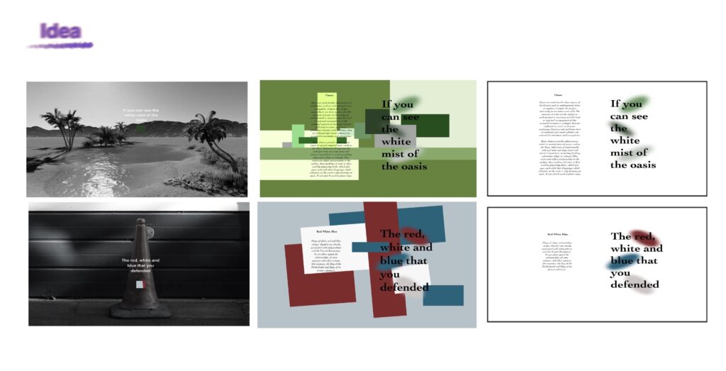
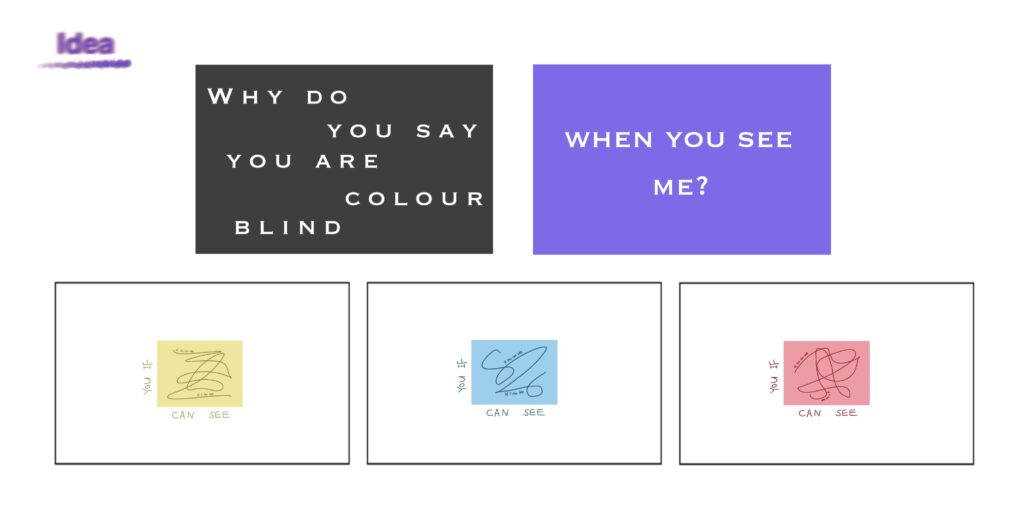
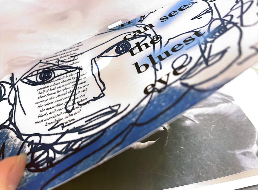
We discussed and agreed on a theme idea for the group presentation: Blindspot.
The deeper meaning of colourblind is an act of discriminatory neglect. The neglect of racial equality, the neglect of injustice, the neglect of a range of situations and so on. It’s not that we don’t see it, but we choose not to see it subjectively.
Luna's personal work process
The part I was responsible for was mainly the typography/poster design of the web pages and the visualisation of the main visual effects.
Several changes were made in carrying out this section. Firstly, we wanted to make the main visual design of the page more black and white and grey.
The site was then divided into a logo, a main video, an introduction to the members (which included a personal page jump) and a display of the members’ e-books.
- Layout Design 1
(Before the changes)
Members’ personal profiles
This is the section of the page where I designed the individual profiles of the six panel members, which was not used later on due to stylistic adjustments and the simplification of the overall layout of the site.
Book presentation screen(1)
We initially envisaged that in the members’ e-books section, the effect would be that each member’s work would be applied to different prototypes (including: TV, ipone, ipad, computer, etc.) and then, on entering the site, all the e-books in the frame would play automatically and when you clicked on a person’s content, it would be displayed enlarged.
This part of the presentation has been adjusted due to changes to the mood board and some deletions at a later stage.
Book presentation screen(2)
Another scheme was created in Adobe XD to show the members of the book. This one is much cleaner and, at the same time, is presented with a sliding fade effect.
Main video visual style attempt
The main video content section of the page is not my responsibility, it was just an attempt to style it because of the overall layout and colour palette in mind.
All of us interpreted images for each line or paragraph of the verse, so for the main video section we wanted to be able to stitch together images of different people within the same verse paragraph (for example, a clip depicting a sunset with six people having six different images, stitching the intercepts together) and to collide colour and black and white to create blocks of colour.
- Layout Design 2
(After the changes)
The mood board reference is replaced with the three primary colours of red, yellow and blue, and the presentation of the colour effect is replaced.
After simplification, the website will contain a main video section, a personal e-book section, and a jump to our personal homepage.
Book presentation screen
This video shows the final presentation of each person’s book in the web page.
- Poster Design
I designed a series of six posters mainly using the design books of six people as elements to be extracted and then integrated.
poster 1-3
poster 4-6
The background images for each of the six posters were taken from the six images of our six team members. Each image is covered with a red, yellow and blue diffused light and is also treated with a hairy glass effect so that it appears to have a blurred texture.
On top of this, a frame was used to transmit a small portion of the clarity behind. The idea is to convey the idea that what you see is not necessarily what you get, and not to deliberately blur the outline of things.
The text is in 3D depth and the colours are black and white to create a strong contrast with the background image.
This was a group project and I think the most difficult part of the collaboration was to agree on the ideas and how to present them. There were times when we agreed on a solution that we felt could be implemented, but when it came time to divide up the work and start moving forward, we found that it was impossible to do so, mostly because everyone had their own ideas and their own style based on the original unified view. There were six of us in the group, so it took us a long time to work together and try out a number of different options, and it was only after the presentation that we were able to really unify our style and overall layout.
In any case, I think that every member of the group is indispensable. We all chose our own areas of expertise during the division of labour and did our best to package and improve the whole content. Also, after the other members’ tasks were completed, the member with less tasks would go and help the member with more tasks to complete the progress, which I found invaluable.
Based on Danny’s Design Lab session on Monday, I wanted to explore 80s artist Neville Brody in Blog 3.
MACD class record
Summary
Firstly, in terms of early concepts, remix culture and conceptual dance were strongly intuitive experiences and Neville Brody’s work was influenced by punk rock, making posters for music colleges in London.
There is some early American primitive pop music originating from the use of ‘found’ cultural objects. Music and artistic expression came together in some form, and in his early studies he explored Dadaism and Pop Art, presenting many works of art in an ironic manner. David Gordon’s phrase ‘to connect is to create’ exemplifies Neville Brodie’s form of conceptual fusion.
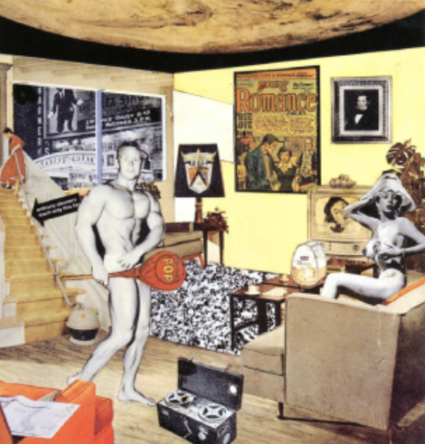
Richard Hamilton’s collage Just what is it that makes today’s homes so different, so appealing? (1956)
Grand opening of the first Dada exhibition: International Dada Fair, Berlin, 5 June 1920.
Notion of dance and St culture
Dialectical
Perhaps, in one respect:
He simply integrates out the views of others. There is not a completely new and complete point of view at this stage. This would be seen as a disguised plagiarism in the eyes of some holders of originalism. But I don’t think that uniformity and similarity of style means complete plagiarism, because there may be some essential differences in what they are trying to say, in the elements of the subject used.
Neville Brody Influenced – Human League 1984
And on the other hand:
I believe that his pre-concept, although combined with the comprehensive thinking of the European avant-garde movement, set the stage for his own artistic development later on.
In 1991, for example, Neville Brody and Jon Wadscroft created the FUSE project, an interactive magazine designed to challenge our current perceptions of print and visual language in an age of changing communication technologies and media. Neville Brodie’s concept also sets a new precedent with a new study of type that is simultaneously revolutionary, an innovative concept born from the fusion of many previous concepts.
FUSE-Neville Brody, Jon Wozencroft(1991)
It took design and typography into a new and unforeseen space. Its major impact on a revolutionary and experimental approach to the language of print still reverberates, and 20 years after its launch, the explorations undertaken by some of the industry’s best-known and most influential names are forward-looking and ahead of their time.
Conclusion
I believe that art has evolved by exploring how aesthetics relates to everyday life and has developed into a leading art form. And this form can be referenced because each stage of social development is different, so the art form becomes broad in which more branching possibilities can be explored and born.
In conclusion, I do not see the integration of other people’s ideas and artistic models as a form of copying, but rather as an attempt to enter the art world in a positive way.
In the brief 2 project, we need to make a visual publication based on the poems that are assigned.
- RESAERCH
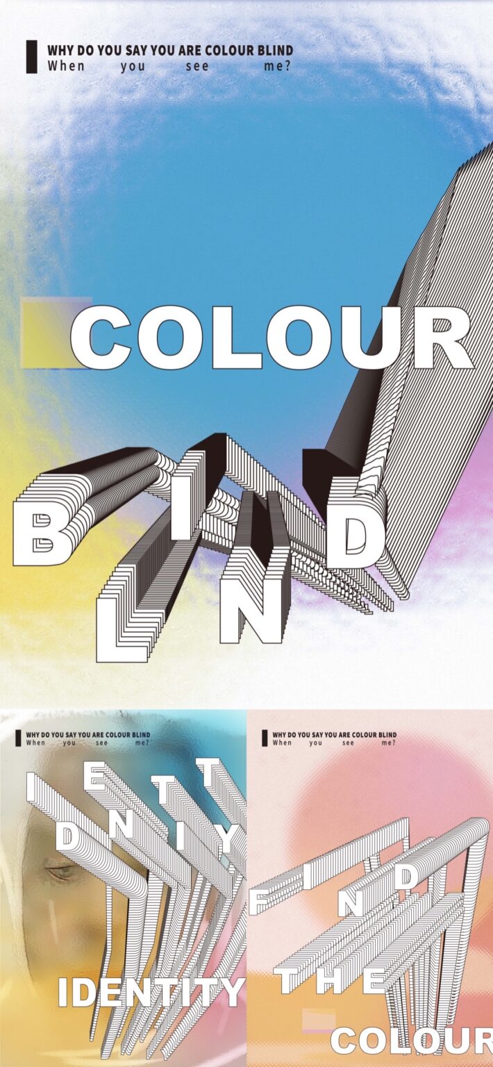
I was assigned the sixth poem: colour blind by lemn sissay. First of all, it is my research based on the poet’s life and the disease of color blindness itself. I put the contents of the draft together.
At the same time, according to the three parts of poetry, I analyze and color correspond the verbs and nouns of each poem, and summarize the poet’s emotion, as well as the changes of the rhythm and content of the poem.
Author background
Analysis of the verses of the first and second parts
Analysis of the verse in the third part
- SKETCH
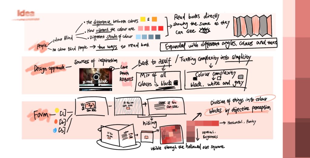
Then there is the sketch part. In this part, I start from three aspects: the audience, the design method and the display method. I hope the audience can be color blind people and people without color blindness.
I concluded that in the eyes of color blind people, color will become indistinguishable, unable to determine color lightness and saturation. So I want to let people read this book in two ways.
sketch idea
The first: from a subjective point of view, black, white and gray pictures are the same, which can be any color you want.
The second:analyzing the color blocks of things from an objective point of view.
My inspiration comes from zime blue, which is an episode of love death robots, a Netflix collection drama, which explains the concept of returning to itself and reducing complexity to simplicity. I thought that all colors would become black when mixed together, and that complex colors could be converted into three monochromes of black, white and gray.
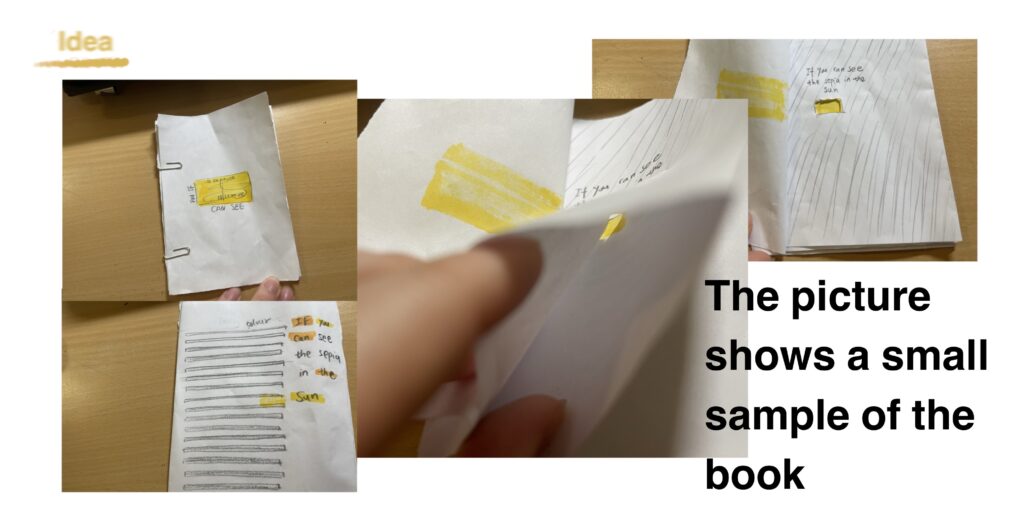
This is a sample I made:
sample of idea
- Ebook development
Part 1
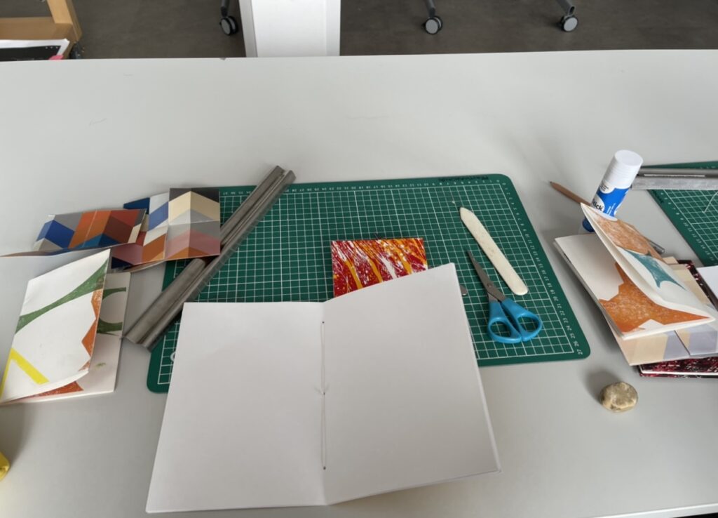
Based on the above ideas, I made a physical book.
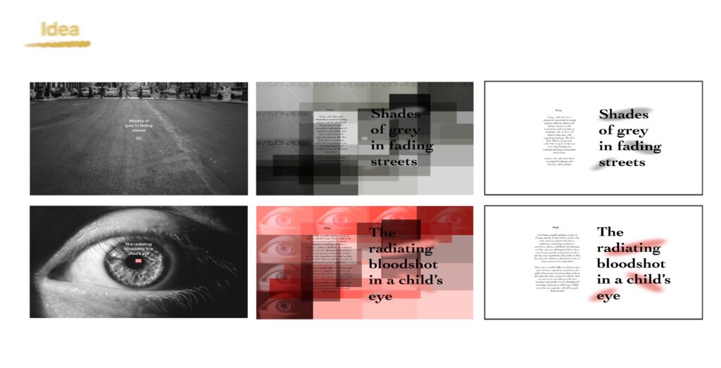
The inner page of the first part of the color map mainly uses the extraction of photo color blocks, which extracts the changes of brightness and saturation of colors of the same color to overlap.
Because the verses of the first part can easily extract objective colors from the verses.
The main three parts of the book
First Part -01
First Part -02
First Part -03
Part 2
The color inner pages of the second part are mainly based on the subjective perception of the color of the scene, and are extracted from abstract lines and the feelings when reading the corresponding verses.
Second Part -01
Second Part -02
Second Part -02
Part 3
In the third part, I used a more general pattern and combination to show the scene depicted in the verse. As the layers progressed, the boundaries between colors and objects became more blurred.
Third Part -01
Third Part -02
Third Part -03
Third Part -04
- Physical book display
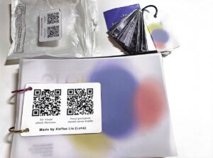
In the display part of the physical book, I bound the colored inner pages of the book with iron rings on the spine of the book, and the complete colored pages can only be seen in the gaps or by opening the iron ring binding.
Cover
By scanning the QR code on the book packaging, you can jump to the display of the e-book and the dynamic image of the visual effect.
The blue world in the eyes of children, through the hollow holes, you can see the colored pictures on the inside pages.
The inner page shows the blue in the eyes of people with different expressions, they are intertwined, and they see the world with their eyes.
Inner hiding color page
Back page
-Link to Blog 1 reference books
In this project, I connected my physical books with QR codes. In blog1, I read the book ‘Internet of Things’ which was very helpful for my book project. The two QR codes on the cover respectively show the electronic version of the visual book and the visual dynamic effect video made with mental canvas.
Link between visual books and codes
The connection between the QR code and the item
- Reflection
In this project, I explored various forms of books and learned about the combination of book content and electronic representation. I think there can be more attempts in terms of content understanding and more presentation forms.
Process 01
Process 02
In the discussion stage of workshop and finished product display, I saw many different ways of expression, which make the book more special and interesting
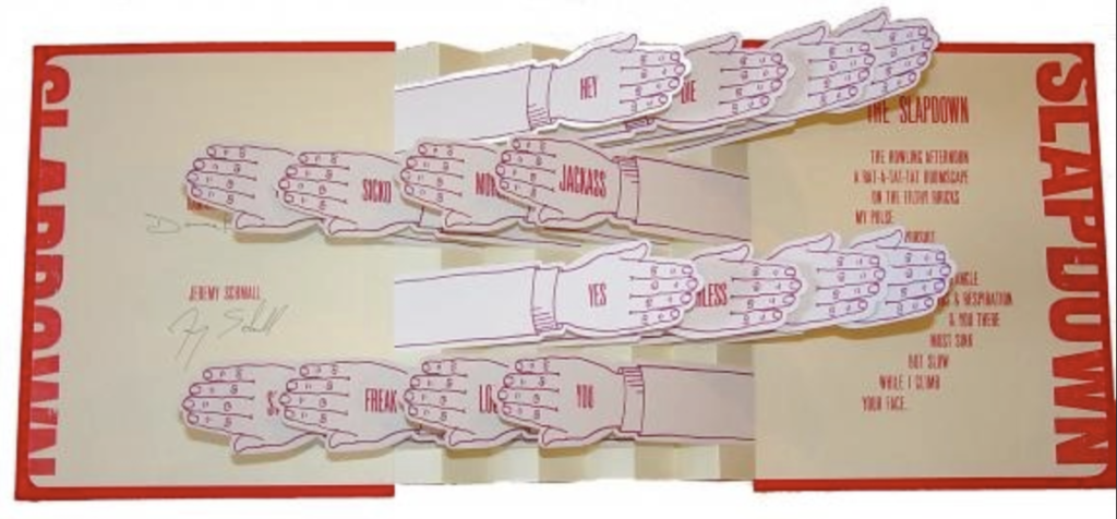
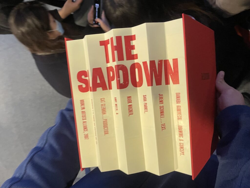
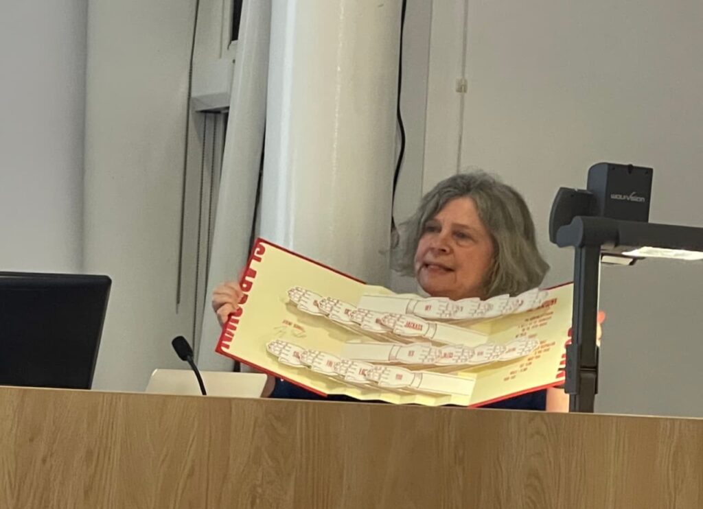
The one that stood out to me during Danny Aldred’s artist book talk on Tuesday was “The slapdown”. It’s interactive and sensory color palettes are interesting to me.
The responsibility for the preparation of this book is Damara Kaminecki, [drawing & concept], Jeremy Schmall, [text ; Sara Parkel, Mark Wagner, Amy Mees, & Cat Glennon, production].
The slapdown
The book is bound on a red iris linen bookcloth board with a black foil title printed on the upper board and the publisher’s name printed on the lower board. Boards arranged in flag book binding with letterpress printed Perma Dur concertina spine and 2 ply die cut museum board flags in the shape of arms and hands.
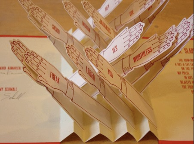
The title and imprint are printed on the outside of the accordion bar binding. Further text is printed on the front and back of 16 illustrations of arms and hands, which are mounted on accordion bars that form the spine of the book.
side of spine
book page opening and closing
The book does a fantastic job of sensory intercommunication, through the opening and closing of the kinetic paper arms, the sound of simulated clapping can be heard, and the words are combined and recombined in a crazy library of curses and curses. Both poetry and architecture evoke the dog-eat-dog tension and petty theft in a crowded urban setting.
It’s a clever combination of irony and functionality for readers to explore.
Feedback
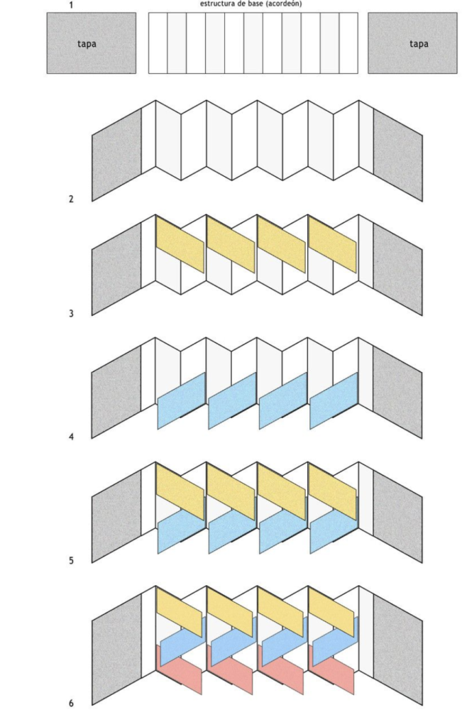
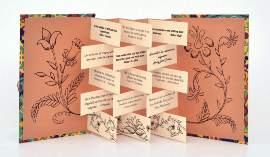
The binding method of the banner book makes the pages overlap and contain more information, and the cut-and-paste pages can also be pieced together into a complete content.
A schematic diagram of the production of a disassembled banner book
Books bound in the same form are also the accordion book by Hedi Kyle, which can display logos with a single image, written text, or combine all logos into one large image.
For this project, I chose ‘boring places’ as the theme for my data statistics and final data visualization.
-RESEARCH
Brain Map | Picture Record
First for boring things, I think about my room. After brainstorming, I chose the view from my window. Because I live in Erasmus Park, my window is next to my desk, facing a forest. So when I stay at home and do my homework, I get bored. But when I’m resting, I look through the window to see what’s outside.
The first part of my sketch is the view from the window, which I have been photographing since February. And persisted for about a week, shooting at the same location, but the weather outside the window, things and time will have subtle changes, so I recorded them to support the subsequent data visualization.
-DATA VISUALISATION
Idea development
First of all, there are a lot of trees in my windows that block most of the sun, and I find that the sun sets very early in the UK in winter, around 4pm. Usually, if I get up late in the morning, I can see the sunset almost seamlessly. So I made a clock watch to keep track of it.
Then as the weather changes, the view outside my window has a different color. I stitched together photos of the scenery outside the window, drawing different color blocks of the weather. I have come to the conclusion that the weather in the UK is variable with a large percentage of rainy days.
After that, in addition to the natural landscape, there are many small animals outside my window. (Sometimes there are people, which confuses me at times, because I can see my private interior completely through the glass.) Anyway, I think there may be more on this grass in front of my window food. I often see squirrels, pigeons, crows and pheasants coming for food, and I calculate the probability of finding them.
In the end, I think the reflections from the glass windows are amazing. Because outside the glass window is a completely spontaneous natural landscape, and my house is like a viewing platform. But at the same time, I’m not sure if I’m looking at the scenery outside, or if the critters outside are looking at me. This way you can see that the orange part in the middle is the light coming from my house so that I seem to be one with the outside scenery.
Anyway, my project was pulled from my rather boring homework and I’m trying to make this visualization fun.
In the first part, the paper first builds on the original old ‘Internet of Things’ concept (when a new object is created, the service creates a unique two-dimensional barcode for that object, which can be printed out and attached to it.) This then leads to an exploration of the modern, digital ‘Internet of Things’.
In the second part, the author explores things and linearity in the wider context of the Internet, which because of the existence of linear adhesions allows everything to exist on the web in the form of information, allowing people’s memories to be closely related to things. It then divides the current labels of new consumer artefacts into three categories along a linear timeline: past, present and future. This ultimately leads to the main question posed in this paper: can the Internet of Things escape the inertia of a society that uses the theoretical basis of purpose in many of its methods of production and manufacture? I think this is a dialectical way of looking at whether the connection between people and society and things can be severed and whether new developments are possible.
In the third part, the author concentrates mainly on analysis, and he uses a number of examples. The first is the different ways in which connections are made between individuals, friends and family, in terms of social relations, public image and biological connections respectively. The author then uses cosmetic surgery to correct genetic traits and films from the past five years that show a more creative way of understanding the past in terms of class and period context.
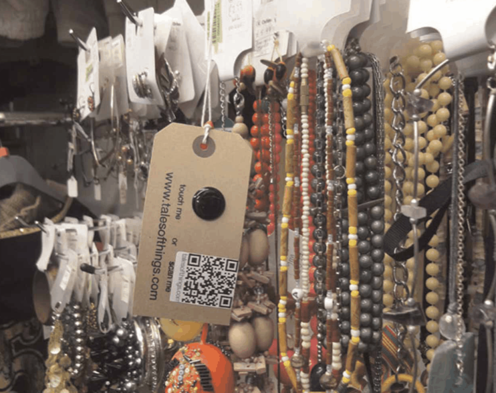
In the fourth section, the author is involved in a creative/technical project called ‘Remember Me’. This project enables an additional connection between people and objects by attaching the memory of the corresponding donor to the tags of items sold in charity shops. This allows the objects to be enriched with an immaterial dimension. The project further explores the potential of digital technology to network the past and develop a ‘network of old things’.
1.2 Does it connect to your practice?
I think it has some relevance to my experimental project. The author’s project “RememberMe” is supported by the “Tales of Things” technical framework, which provides theoretical support for my project. The web port interface has a lot of scope for development, as it also uses an interactive approach, allowing the information about the item to be represented in a single QR code, enabling the conversion of devices and the interchange of information. My future projects will probably use the same concept to achieve two-way interaction between people and things, and people and machines.
Tale view in Tales of Things. RememberMe at FutureEverything 2010 (Photo # WeAreTAPE).
But on the other hand, I think there is still room for more development of this concept, perhaps going beyond the limitations of QR codes and barcodes to create new ways of connecting people to things and people to machines, and I hope that in future projects there will be more room for development.
Scanning the red silk toiletries bag. RememberMe at FutureEverything 2010 (Photo # WeAreTAPE).